Showing posts with label Illustrator. Show all posts

Wednesday, 19 August 2020

Bathscape Walking Map. Part Two

 Armed with the information from the walk and (obviously) a brief from the client, I sat down yesterday to start drawing the map. This is just first draft, I have a feeling there will be many drafts. Already I can see changes I want to make. For what it's worth, I think the rear works better than the front - but that may be the effect of the pencil drawing here - makes it look very busy.

That green lettering has to go!

Red tint is result of poor scan.


Sunday, 31 May 2020

Quick Logo? Never a quick logo...

Had to put together a website for University work. You can see it here. It's done in Wordpress and I'm still not that fond of Wordpress - or any other template driven web authoring process. (I know that Blogger would fall under that heading - but I don't care how the blogs look - much.
Template needed a logo. Instructions were absent, but a bit of experimentation established that it requires a square logo to fill the space.
Since I want to keep it simple, decided to just use text.
That was my downfall.

Trying out fonts

I was looking for something tall, narrow, sans-serif. Not to angular. In the old days of Letraset, that would have been Compacta, and I quite like that 60s font. I have a digital Compacta, so I tried that.
And when that didn't quite work for me, all the rest. Then, when they didn't work, online to Typekit and download every, and I mean every, font they have.
Set up the words "Stephen Spicer Art" in each one. Some are easily eliminated, but many are not.
Here's the first short list:


What's becoming clear is that I'm worrying about the shape of the uppercase "S". On Many of these fonts it's quite angular, and I want a more cursive one. (By this time I'm about 90 mins into this operation.) 
I eliminate some and then put the type into blocks as you can see below. I'm now nearly two hours into this and getting frustrated with myself for fretting about very small details.
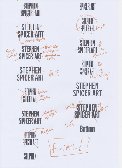


I force myself to compare one with the other. Eventually I end up with "Interstate", no doubt inspired by the clear typography on US roads. It comes in 36 weights. 
I'm not a big fan of Adobe TypeKit fonts. You only have them for the length of your CC subscription. Since I'm planning to wind that down over the next year or so, it's not a good policy to base long term projects on. Still, I'm just using it for this time so it's OK. I'll no doubt rework it (and the website) if I decide to keep it.

Lightbulb moment

I can't make it work still. Close, but no cigar...  Then I realise that if I use the word "Artist", not art, then it becomes easy.

Illustrator

So type is set up in Illustrator. There's some tracking and kerning needed but it fits, and nearly three hours in I want it to end. 
Here's the type in Illustrator. Currently it's RGB black. You can see the type controls.


Next stage is to make it white and add a black outline for clarity. Except this won't be an outline, it will be an inline to preserve the shapes. If you compare the two following screenshots you can see how the true outline makes the letter spacing go awry.Once again, getting bogged down on detail...

Outline version note the P.


Inline option. Much better.


Now to add a bit of colour. Added the red to the name and tested. It's a bit overpowering and send the wrong message:


Swapped them over. Fed up with the time this has taken, but pleased that I care enough. Used this version - almost!
Have, for the moment shrunk it a little. Works well on mobile, still not that good on Desktop. But that's a problem for another day.


Friday, 3 May 2019

Bleeds, and why they are important.

When I'm looking at student work for print from a technical point of view the most common error is forgetting, or not knowing about, the bleeds.
The printing company will trim up your job after it has been printed, collected and put together so that it has a nice clean sharp edge. Which is why you had it professionally printed in the first place!

Why have a bleed?

The most obvious reason is because you want to print an image to the very edge of the paper. Professional printing machines - and most domestic ones for that matter, - can't print to the edges. Normally they leave a small gap, since you don't want ink all over the place inside the machine. Incidentally, even one-off inkjet prints in my opinion shouldn't be printed using the edge setting, if the printer supports it; because this can still result in ink everywhere.

How can we set a bleed?

To enable this to happen when we are art working a publication for professional print - of any kind -then we incorporate in our artwork a bleed setting  so that the printer knows where to trim. Even if you are not actually taking the print to the edges the printer will expect it and may reject your artwork if it isn't incorporated. definitely it is needed if you have images - or just colour that you want reaching the edges of the paper. For this short tutorial, I'm using InDesign as an example, although many other professional layout software works more or less the same. Word is not considered a pro bit of software for this purpose.

Setting the bleed in InDesign

If you have a modern version of InDesign, then the file setup looks like the image below, the bleed setting is highlighted with the red circle. Note I've removed the side with all the presets on. Older versions look like the one below that. Bleed settings are usually 3mm for Litho or Digital print. If you are doing banners or posters, check with your supplier or use 5mm.


When you have done this, your document should have a red outline outside the page like shown here, the pink line is the margin - make sure you don't confuse the two:


All your artwork that you want printing to the edge should go over the edge to the bloodline. It's OK to take it further than this, you don't have to tidy up, as InDesign will just ignore it.

Practical example

So here's a job I just did and is at the printers right now. It's a flyer for some art exhibitions in about a month's time. This first picture is what the finished job wants to look like. The background image extends to the edges of the paper. 


So to do this, I have set up the file with a bleed. In the next picture, you can just make that out under the background image, and you can see how the image meets the bleed:


Once the artwork has been completed, my suggestion, always print it out with trims so you can check all of this; you need to make a PDF to deliver to the printing company. They will in turn run a preflighting piece of software over your publication to check that it should print OK. Often, if you have forgotten bleeds it will fail this, so get it right. It will also fail for technically wrong colours of ink and pictures that are too low res.

Making the PDF

Making a good PDF from InDesign is straightforward. Go to File > Export then PDF (Print). Select your print setting from the top drop down. I usually use PDF X3 (2002) but ask the print firm. Many don't care that much now, but occasionally one will. Incidentally PDF X3 will give you slightly better colour if you are printing digital IF the process allows, although most times it makes no difference.
When you are in the PDF dialogue box make sure that you click on "Marks and Bleeds" and select "All printers marks" and "Use document bleeds". See below.


Now make your PDF by clicking "Export" InDesign will grind away for a short period and then your PDF will be ready. When you look at it it should look like this:


Congratulations!

What's on the print-ready PDF?

Your PDF incorporates a number of marks. Here's what they all mean and do:
  • Two sets of trim marks the innerness where the printer will trim your print and the outer set are the bleed marks. 
  • On each side there are registration marks, used to align the separate colours when printing in full colour.
  • On the top there are two sets of colour patches. You can use these to check the accuracy of any printing. If you print this out with the colour bars, you should get a nice even greyscaleon the left and colour patches on the right. If you do the on one of the college printers you notice that the dark end of the greyscale is hard to see any difference. One reason that these printers are less than satisfactory. Curiously, they print far better if you print from a PC rather than a Mac. Put your job on a memory stick and print out in the Library to see the difference! The reason for this is that the printers are calibrated for aPC colourspace and not that of a Mac/InDesign. I have tried to change this, but have failed. :-(
  • At the bottom you can see a file name and the date and time of creation.


Thursday, 23 March 2017

Producing Artwork for the Lasercutter

This is a guide to producing artwork (the type of artwork we are doing) for the Lasercutter. It's not a definitive guide, it's what I found that works and is simple for people to understand and use. I realise that as I write this it may be too simple for some applications. If that's you, please move on.

IMPORTANT: If you find an error, please let me know!!

How it works

You are setting up a file where you want the Lasercutter to carve or cut out shapes.

You are using the Lasercutter because it's:
  • Repeatable
  • Quick
  • Accurate
  • Cuts finer than you can with a Knife.

The Illustration.

Draw the picture. Use any tool you like - Photoshop, Illustrator, black ink on white paper.
In your drawing the white areas are areas that will cut out, the black areas will stay.
When you are drawing, remember that areas of black surrounded by white will fall out, so if they are to stay you will need to provide some support.

Open in Photoshop

Open your image in Photoshop. If it's ink on paper you will need to scan it. If it's Illustrator you can open it directly.

Make sure that it's the size you want and the resolution is at least 300ppi. 1200 will be too much.


In Photoshop, max the contrast so it's just black and white.
Notice I've checked the "Use Legacy" box. This means it will be just black and white.


Convert to greyscale. This last step may not be necessary - you are aiming for pure black and white and it may help.


In photoshop examine the image carefully. Iron out any bumps and clean up any stray pixels. 

Photoshop is the easiest place to do this.


Save your file as PSD.

Open Illustrator

Create a new file the correct finished size. 


Place the Photoshop file


Select Window > Image Trace


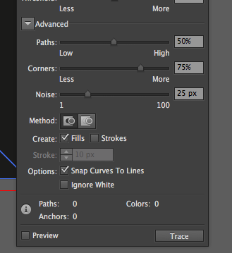
The Image trace window appears.


Click on "Advanced"


Click "Ignore white"


Make sure Preview is selected

View the image on the screen while you adjust the sliders. You are aiming for the smallest number of corners and paths that will still give you the image you require.

When you are happy, close the trace image window.


Select the traced image (if it's not already selected).

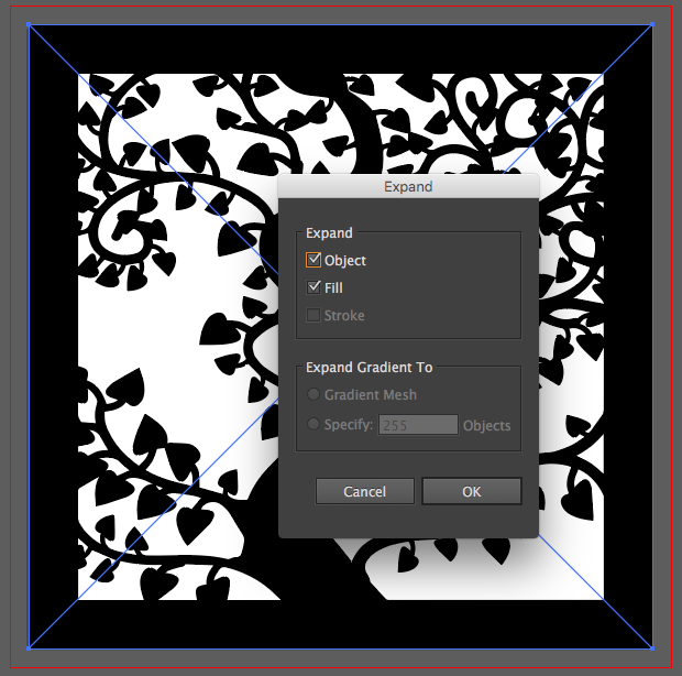
Select Expand.


Check the image by going to View > Outlines.

You should have clear paths. That is where the cutter will cut.


Choose export to DXF. Use the older settings (Our Lasercutter software doesn't understand the newer DXF settings from Illustrator.)


That's it!

Monday, 4 July 2016

"What was the most complicated Illustrator drawing you ever did?"

Last week when I was teaching Advanced Illustrator elsewhere, I got got asked "what was the most complex Illustrator drawing that I’ve ever done?” Interesting question since they (here at least) tend to grow. 

But there could be two or three answers to that which came to mind immediately:


Miss-Information. A where’s Wally style festival spotters guide. Had to draw - or more accurately produce about a 1000 people. Probably in this enlargement you can see me, I did a homage to Wally in there as well. Well, at least the hat.

Map of Bath for Fringe Festival - probably took the longest to do. Here’s a section. The college (without the Roper extension) is at the top. The Hershel building is missing, because, if I remember correctly it was hidden by text or something. Not much point drawing what you can see!

One of many drawings of electropunk insect. Drawn for a show that I did some time ago, currently being revived as the show has a booking this summer. This one will be published as a postcard this summer.