Template needed a logo. Instructions were absent, but a bit of experimentation established that it requires a square logo to fill the space.
Since I want to keep it simple, decided to just use text.
That was my downfall.
Trying out fonts
I was looking for something tall, narrow, sans-serif. Not to angular. In the old days of Letraset, that would have been Compacta, and I quite like that 60s font. I have a digital Compacta, so I tried that.And when that didn't quite work for me, all the rest. Then, when they didn't work, online to Typekit and download every, and I mean every, font they have.
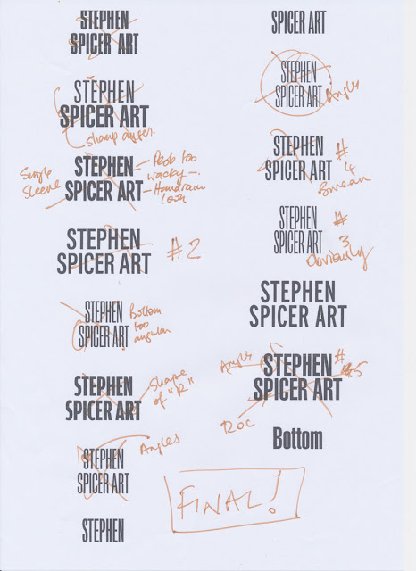
Set up the words "Stephen Spicer Art" in each one. Some are easily eliminated, but many are not.
Here's the first short list:
What's becoming clear is that I'm worrying about the shape of the uppercase "S". On Many of these fonts it's quite angular, and I want a more cursive one. (By this time I'm about 90 mins into this operation.)
I eliminate some and then put the type into blocks as you can see below. I'm now nearly two hours into this and getting frustrated with myself for fretting about very small details.

I force myself to compare one with the other. Eventually I end up with "Interstate", no doubt inspired by the clear typography on US roads. It comes in 36 weights.
I'm not a big fan of Adobe TypeKit fonts. You only have them for the length of your CC subscription. Since I'm planning to wind that down over the next year or so, it's not a good policy to base long term projects on. Still, I'm just using it for this time so it's OK. I'll no doubt rework it (and the website) if I decide to keep it.
Lightbulb moment
I can't make it work still. Close, but no cigar... Then I realise that if I use the word "Artist", not art, then it becomes easy.
Illustrator
So type is set up in Illustrator. There's some tracking and kerning needed but it fits, and nearly three hours in I want it to end.
Here's the type in Illustrator. Currently it's RGB black. You can see the type controls.
Next stage is to make it white and add a black outline for clarity. Except this won't be an outline, it will be an inline to preserve the shapes. If you compare the two following screenshots you can see how the true outline makes the letter spacing go awry.Once again, getting bogged down on detail...
 |
| Outline version note the P. |
 |
| Inline option. Much better. |
Now to add a bit of colour. Added the red to the name and tested. It's a bit overpowering and send the wrong message:
Swapped them over. Fed up with the time this has taken, but pleased that I care enough. Used this version - almost!
Have, for the moment shrunk it a little. Works well on mobile, still not that good on Desktop. But that's a problem for another day.


No comments:
Post a Comment