Saturday 25 April 2015

Designing a promotional leaflet for BridgeCare

BridgeCare is a local organisation that looks after the well-being of older people and their carers in Bath. It was founded and is still partially run by people from the church I used to go to.

Recently they have asked me to design some promotional material for them - which I'm really pleased and privileged to do.

 Bridge care websiteThis is right in core business, since I have been involved in the not-for-profit and charity sector for most of my working life, and have several other similar organisations that i help.

This first project is about about day care services, but I have also got to write a style manual for all the outgoing communications. Later there's some more brochures, photography and a website. You can see the current website here by clicking the screenshot.

First job is to find some suitable pictures for illustrations. I got them to list the activities they do and hopefully I'll be able to illustrate most if not all. As they have a small budget, in most cases I'll be looking to Creative Commons for royalty-free imagery where possible. Although I fancy getting some good pix myself for the beetle drive.

Wednesday 22 April 2015

Guides are delivered!!

Impressively large lorry delivered 35000 Bath Fringe Festival guides yesterday. Little boy moment - I'm kind of responsible for that and clogging up Walcot street for the time taken to unload...

Sunday 19 April 2015

Designing(?) puppets/automata

This is a rough drawing for a puppet. It's not very imaginative, but I quite liked it. I used the metaphor of a puppet for mental health issues some time ago - the idea of someone else - or another, less controlled part of your head pulling the strings.
This pictures was based on an artist's lay figure. I have the notion that I could use that at least as a prototype and maybe as a way of getting the rough shape and articulation. They can be brought now for around £3-4 in the shops, and almost you couldn't buy the wood for that. Certainly it saves a few hours of cutting and shaping.
Right now I'm not quite sure how to do the joints. Just stringing would mean that they would turn in unnatural poses, so either a cloth or leather hinge comes to mind.
I did get a couple of smaller figures to play with, but I think that they will be too small to work with and possibly too light. But I'm going to give them a go once I've figured the articulation though I shall replace the heads.
Really I need to be turning paper into tangibles. Perhaps that should be next week's task.

Saturday 18 April 2015

Designing the Ghost House

In the posting I did about the doll's house that we are building I mused about whether or not it could be automated to give the appearance of people or things living inside it.

Since then I thought a bit more and I think it's entirely practical that such a thing could be done and the diagram here gives an idea or two.

First up is using puppets - or automata - to give some motion to it. The mechanism can be hidden in the roof or floor - depending if they work by string or wire. Here you can see a ghost coming down through the floor and another skull making the same trip. Although these are shown using cranks, intact I'd probably use small servos or stepper motors to allow them two be moved individually. While the romance of brass cams and steampunk mechanisms appeals, using electronics gives more control and would allow interaction between the ghosts and the viewer in a less predictable way.

The last ghost, sitting bottom right in a chair is a variation on pepper's ghost a victorian illusion that I keep find now days being referred to as a 'hologram'  - it's not. It's a simple partial reflection that unless done live isn't even stereoscopic. In the use of the effect above, the originating image is a LCD screen built into the floor. You can see the reflective glass at 45 degrees and the ghost will apparently sit on the chair or move around.

I don't suppose I will ever build this, at least not in this form; but it was a good think through and design.I also quite liked the drawing that I did - at the moment I'm still into grunge and imperfection in a big way.

SS April 2015

Friday 17 April 2015

Burning the midnight oil and sending it all off.

So some few days without a posting. Back to normal I suppose. Overall it went fairly smoothly this year. No last moment panics - although did get one advertiser wanting to make a change just after we had 35000 printed.

Got some time off to do things like sleep and eat but only just:
  • Friday 12: worked all day and most of night. Bed about 6.00am
  • Saturday 11: Worked all day from about 9.00am until about 16.30; then from about 20.00 through to 4.00am
  • Sunday 12: Worked on guide 12.00pm through to 4.00am.
  • Monday 13: Worked on guide from 6-8am, then 16.45-2.30.am
By this time I have artwork about 60 pages or so. The 40 in the guide plus half that I did twice.

Tuesday 14: Had lessons at college for most of the day, checked proofs as I went along. Uploaded the files around 4.00pm, which I did as a demonstration to a few students.

Went like this:

Days of handing over hard copy in one form or another are long gone. Now it's all print-ready pdf, which as a designer you better make sure that you understand. (Incidentally, I do a course on this - shameless plug). Even so there's a few things that ca trip you up or particular issues that one system has that you don't expect.

In this case after half an hour trying to upload a file that I thought was perfectly good, only to have it get dropped without a meaningful error message (see next screen) I finally remembered that this system doesn't like anything other than simple ASCII filemanes, no spaces no "unusual" characters in the filename. Renamed the file using underscores thus"fringe_guide" as opposed to "fringe guide" and the Kodak system was perfectly happy. You would have thought that they might have warned you or given a sensible error message.


Once you pages are uploaded the system's preflight kicks into action. This goes through each page and the system makes a technical evaluation of each page. I expected this to fail and had made a note of it when I submitted the file - we had one or two pages where there was a low-resolution file. Dutifully they were failed. The rest of the pages I have to click on approve, download a proof or set up for replacement.


In this case rather than go all through the process of calling up the printer and going through I opted to cheat. I opened up each of the problem files in Photoshop and simply doubled the pixel count. This doesn't do anything (You can't upscale picture to get more detail - usually if anything it looks worse) other than make the preflighting software happy.

Out of interest I did a tiny test. I upscaled using two different algorithms to see if there was any difference in the final quality. My hunch is that they will look the same.

There was one last call from the Printers before it went on Press, they had noticed a small issue with the front page. Whilst no-one would of noticed I suspect, out of professional pride I fixed it and the job then went to the press.

We wait with interest.

Pictures from the Artists' book fair - Arnolfini April 2015

Took an afternoon off from doing the Fringe Guide last weekend to visit the Artists' book fair at the Arnolfini gallery in Bristol. Looked like it could have been good, so I had suggested to my students that it might be a good idea for them to come along and see what was there - especially as some of them were talking about doing something similar.

To be honest, if I hadn't said that I would have probably given it a miss - I was up to my eyeballs in the Fringe guide at the time and could have done without the distraction. However, I went - saw some exceedingly good work - didn't see any students. (A little of me was glad since I had offered a minor bribe - if they had all turned up could have been expensive.) (Yes, you're all worth it..).

In no particular order here's some shots of things that caught my eye. My wallet was caught by two books - would have been more - but I've got to eat as well.

Sone nice, fairly standard production book, particularly taken by the Eggar-tist one bottom left.


Selection of letterpress/block printed books. Want to do some vaguely similar for the Bedlam leaflet for Bath Fringe Festival. That is print from block. Did have this idea of doing the whole thing as a Linocut, but lino doesn't have an undo button which that kind of product needs!
What is it about bugs that I find interesting? These were engravings made up as books - exquisite drawings with fine, high quality printing. Tempted to buy one, but not quite sure what I would do with it.
Lots of little books, some full of poems or drawings. Others prose.


Strange books and objects, some fun, many fairly obscure. Like the "Affordable housing" piece at top left.
More hand-printed tiny books. Some are linocut others are screen prints.
Delicate model making from old books. One of a couple of things where old books are cut up or into to make objects. Bath Library have run a competition in the summer holiday break using discontinued library books. Must say that I still find this kind of destruction of a book a bit disturbing. And I speak as someone who made four life-sized papier mache apostles from old bibles.
For me the star of the show - difficult to photograph effectively. This is a paper cut-out that forms a graphic narrative. It's a strip of A0 (?) paper that has been laser cut incredibly finely; I would guess that parts of it are no more that 0.5mm wide and it folds down to a large fan-like structure.

I was in awe...
Same idea, but a bit smaller from the same people.
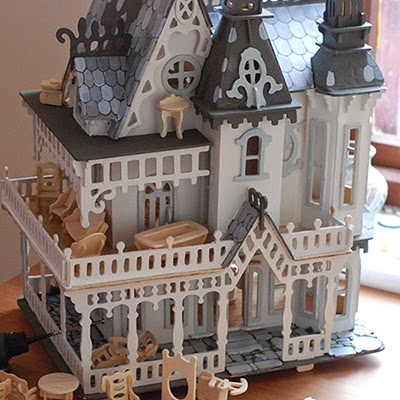
Collection of books that told a story, exhibited in the doll's house that they are writing about.

Selection of comic books and graphic narratives. Brought one similar that had been produced using silk-screen print.

Saturday 11 April 2015

Day six, another few pages bit the dust.

Here's one:

Fringe guide - Day six: Artwork begins to roll out.

Yesterday was fixing details, formatting text, checking text, chasing text.

Fortunately the people (Steve Henwood and Wendy Matthews) who run the Bath Fringe Festival are real pros  and when I get the copy I know that:

1. It will be be about the right length,
2. It won't get endlessly re-written.
3. The amount of error correction will be minimal.

Still I won't fine tune the copyfit until after the proof-reading stage. Fine tuning can take up to half-an-hour a page as you track little bits in and out, make minor edits and all that guff so it fits in the space that has been alloted.

Pages written by non-professionals is generally a different matter. Often it is way over or under length. Sometimes the authors are very precious about their copy and resent having to cut or extend. Very frequently seeing it in type makes them reconsider and want to re-write. To accommodate all this the designer has to give them extra time and not bust a gut on the first draft.

Over the last 10 hours I've been collating and shoe-horning the Visual arts pages. Going for quite a bold design made extra work, but I'm very pleased with it - especially the text going around the images. See what you think.

This is the message I sent to the proof readers:

"FaB pages in main guide. These pages are UNFINISHED. There are a couple of shows to be added, plus some backgrounds, colours and other graphic elements. They have not been spell checked. If you can see a FACTUAL error then let us know. This is NOT the time to have second thoughts on your copy. One or two I have shortened because you were well over length."


Thursday 9 April 2015

Bath Fringe Festival: Day 4 - checking and installing colours.


The guide has a cover picture that has a number of colours in it. For the main part of the guide I want to be able to use those colours elsewhere. To do that I used the original Photoshop file, which being CMYK already meant that the CYMK breakdowns would be consistent and used the colour sampler tool to click and select various colours.
The breakdowns you can see in the box on the picture below.
These are then dialled into InDesign in the colour swatches. There is a colour picker tool in InDesign, but that reads the RGB component and then translates that to CMYK. While this is uvula, this method - although a little longer is more reliable.

You'll notice that there's a few very tiny percentages. Probably I'll round these off. Most presses can resolve a 1% dot reliably.

I noted down the percentage by doing the screenshot you can see here and then opened up the file in InDesign and make some new swatches.

Here they are in InDesign. As they are in the swatches they are 'global colours', which means that if I change the swatch, all the colours objects that use that swatch will change as well.

Day Three: Setting the grids.


The grid is the structure behind a page. Designing the grid in a multiple page publication, along with setting the styles is a big part of designing it.

Often, for a new publication this will take me as long as the layouts themselves take. If I have got the grid and styles right then the pages will almost (almost!!) take care of themselves. 

Everything will have a place, each item of copy will have an associated style and other than jiggling it all around to fit in, it should get to a first draft fairly quickly.

Which is why I've gone through this process throughly - so that I can hammer through the remaining pages fairly quickly.

In this publication there's three main layouts plus a couple of minor ones. There's the listing pages that are four columns - like the one here from last year. 

Then there's the feature pages, these are signified by being three column pages - wider to let the text breath a bit. Also I've been a lot more casual about the positioning of pictures on this page. Even so, the underlying structure is still there, but the "random" placing of images makes for a more interesting page.

Finally there's some six column pages for indexes and small listings. The type is also smaller here as well.

This year's changes

To be honest more evolution here than revolution. Generally the styles and the four column grid worked well. Getting the right sizes and weights of type took a lot of work last year and while I've tinkered with it, I don't think I need to make whole scale changes. 


One thing that I have tried however is a five column grid. I mocked up a page using some of last years listings - it's the one on the bottom here - and I have moved the date to the centre top of the page. Largely I kept the styles of text the same. They worked last year, so they will work again.

This year it'll all be a bit more formal. There's whimsical images to add that match in with the front cover that will add some texture and contrast to the pages. I'm keen however to avoid the blobby look from last year, so they will be kept sharp.

I have to invent some appropriate icons for the free events, the special events and anything else the client wants to highlight. And once I've done that there's the trivial job of turning around 40 pages in 16 hours or less.

FAB (Fringe Arts Bath) Pages.

These are almost a magazine within a magazine. The client said "Make them very different from the rest of the guide". I think there's a feeling that last year they were not sufficiently differentiated from the guide as a whole.

The blue page here is a FAB page from last year. You can see if you compare it to the four col. grid at the top there's a lot in common. That was partially deliberate and partly accidental. Accidental because basically I ran out of time to work on them and they had to be artwork very quickly.

This year I'm trying to make amends. I have opted for a six column grid, although the major pieces occupy two or there columns. I have also use a large number of round frames and run the show titles along the outside.

Finally I have used the device of laboratory equipment to link things together on a textured background.

The design you can see here is a rough. there's bigger image you can see by clicking the separate picture below. In the final - if it's approved (hopefully you and I will know later today) the lab equipment will be 'proper' drawing and the layout will be better. Incidentally this is last year's pictures and copy. I did that so there's some basis for comparison.

Reflecting on the design, I have issues about the background texture; is it too busy? Is there something else I could use? How experimental could I go? I don't like the lab equipment drawing - but I think that's because it's a quick lash-up in Illustrator rather than being a duff idea.

And the grid. Is six columns too symmetrical? Should I try with seven or five? Right now it's three AM and perhaps I should give up thinking for a few hours...


Tuesday 7 April 2015

Fringe guide: day two, going through the pictures.

Woke up this morning at 4.00am. Lay there, designing guide pages in my head. After about 20 mins decided that I might as well get up and do them for real.

Today's job is going through pictures and adverts. There are a high number of images from many different sources. When they come from people I know well then I don't always go through this process - but when they have been supplied by any number of different individual and organisations, many of whom won't know the technical or legal implications of what they are supplying then usually it pays to open up each one, make some changes where required and re-save. That way I can often save myself and a client from an issue later in the production process.

This is a screen shot from photoshop that shows a file with plenty of pixels in it. This one came in at a huge size, nearly a metre wide at 72ppi*. I'm using Photoshop's image resize function - but with resample switched off. This means that it changes the numbers but doesn't actually resample the image. Changing it this way and setting it at 300ppi means that when it is imported to InDesign that it will come in at a nice size/resolution ratio. It also means that I know I can increase the size a bit without worrying about having the pixels visible on the final product. The file is then saved out as a PSD (Photoshop native) file for placing into InDesign.

Pictures come in all sizes and labelled in ways that can be confusing or just plain wrong. This picture, which I bet looked OK on the web page they took it from is way too small. Resized it's going to be about the size of a postage stamp. If I have to use it then I will double up the size and add some imitation grain to cover up the blurriness of the photo. Frankly it's pretty much unusable - but it's the kind of issue you can miss if you are just placing straight into InDesign and not paying too much attention, as the file size (200k) should have been a big alarm bell ringer.

This year most pictures have been 'print' and 'web' versions. In about 50% of cases these pictures were more or less identical and both too low-res for print. About 25% too small. All in all around 200 pictures to go through.

Why 300 ppi?

Most times you will hear people quoting 300 ppi for print production. If you ask them why it is likely that this is something they heard and they just kept doing it. 

Truth is there's nothing particularly magical about 300 ppi. The rule of thumb used to be that the process screen resolution - that is the half-tone screen that will generate the small dots we print with - had to be 50% of the size of the scan to avoid complications.

Often a 150#** screen is used in commercial print, so 300 makes sense. Trouble is through:
  1. At the time people first started talking about 300ppi, the common screen was 133#.
  2. Modern screens are higher 175# - 200#
  3. Conventional square dot screens are falling out of favour anyway, being replaced by scholastic screens which use random dots in clusters.
My theory about 300 is simple. It was the highest available resolution for the first few generations of scanners, so simply we are grabbing the best quality we can. Now days I'd prefer 400ppi, and I always scan my own pictures at 600ppi, 48 bit and then use Photoshop to sort out the file.

* PPI=pixels per inch. as opposed to DPI which can mean a number of things and can be confusing.
** The # symbol means line screen here.


Monday 6 April 2015

Planning the pages.

Work continues on the Bath Fringe Festival guide. I got some of the copy yesterday, although I haven't got any pictures yet which makes doing layouts a bit pointless. Still entering text in the right places, deciding on typefaces, colour count and finding a new/different way to do the map will all fill up today quite nicely. Here's a screen shot before any text was added, you can also see the new typeface I may use: Century Schoolbook.

There's forty pages in all. Tomorrow morning I will spend a lot of time getting the type right. Once I've done that I'll set some InDesign styles so that I can apply them as I go through the text. Styles will make the whole process a lot quicker - and if  change is needed, make it easier to do globally.

In fact everything will be governed by a style as much as possible. Not only the text, but also the frames that hold pictures. tables, shadows. Anything that can be a style will be. InDesign allows styles to control character, paragraphs, text frames, picture frames, strokes, cells and tables in your document. It's the secret to getting your document to be consistent throughout. It also means that a job I do every couple of months that's a lot of fiddly styling can be done economically - which means the charity concerned get a nicely designed mailing without it costing the earth,

Here's the style sheets for the last Fringe guide. This year I shall edit them which will save hours - rather than create them from scratch.


Starting the guide...

So this is the third year that I've designed the contents of the Bath Fringe Festival guide. I thought, especially for the benefit of some of my students you might like to see how I do these things. I'm not saying it's the best way, and I expect there will be many trials on the way.

For a reminder this is what last year's cover looked like - I didn't do this it was a student from Bath Spa University, I did the contents.


To make the cover design feel like it belonged with the rest of the publication, I spent and hour or two dropping ink onto paper until I got some nice blobs. These were then scanned, covered to 2-bit graphics and colourised in InDesign. They used a Multiply blend so that you could see through them to what was underneath and so that the colours mixed on the pages


Incidentally, all these pictures are quick screen shots I did while working on the 2015 guide. That's why you can see the construction lines and guides.


Here's a spread from the finished 2014 guide. Makes use of cutouts and text wraps to add interest. Also angled text. Challenge is to make this year's different enough. Quite happy with the blobs although they did get a lot of remarks. Curiously, this year's cover (2015) which I'm not going to show until it's published - also features blobs. But I'm definitely not going to use them again!


This is the FAB (Fringe Arts Bath) side of the A3 flyer, It's a pretty formal layout that contrasts well with...


...the rear, which is designed to have a 'home-brew' look about it. This year I'm trying to think of better, out-of-the-box print solutions for this. I guess in the end time and money will decide.


The house that Steve and Ruth built.

OK, so this is a Quay kit (http://www.quayimports.co.uk/d004_fantasy_villa.html) that we picked up last year. Lots of parts, abysmal instructions and does hold together without glue. Brought it because Ruth always said that she would like a doll's house - so decided that this would be the one. To be honest there are not many dolls that size/scale, but I thought it would be an interesting exercise building it. Been on the go now for six months. Didn't do much over Christmas periods, brought some titchy furniture for it a week ago and that revived the interest.


Here's the front with all the furniture drying on the balconies and verandas. Some are more successful that others. All of them, leave gaps for the imagination - i.e., they are not perfect facsimiles of the originals. Have a look below at the bathroom furniture.


Not finished yet! Painting roof tiles. Quite happy with them once I've done3 some but taking some time. My hand isn't as steady as it was, and I don't seem to get the paint in the right consistency. 


View from the back. All the time I've been building this, I've been wondering how you could add some life to it. I thought of an idea recently that I'll put up in a separate blog posting.


Interior, washroom. Too small for the bath to stand in so just and on-suite loo and washbasin. Although you could confuse the wash basin for a sewing machine.