Showing posts with label bath_bafineart. Show all posts

Wednesday, 9 September 2020

Progress on the tree painting...

Progress on the tree painting. I have the main shapes in. After a false start and several experiments, I finally started using #liquin fine detail to get the consistency I wanted from oil paints. Not perfect, but that may be some very old tubes of paint that are very stiff anyway. Second photo shows detailing. 

Will be unified with a glaze like final snapshot.

Whole image, it's 100cm x 100cm on canvas. Have painted about 25% of detail. Really taking ages, about a week now. Manage around 3 hours a day. But not every day. Arm aches after that!


Close up of detailing. First layer, will need light/dark/underpaint in-between lines. Then glase with overall wash.


Test glaze. Needs bit more work. Struck me I could use a gold underneath or even gold leaf in a future project.


Wednesday, 19 August 2020

Bathscape Walking Map. Part Two

 Armed with the information from the walk and (obviously) a brief from the client, I sat down yesterday to start drawing the map. This is just first draft, I have a feeling there will be many drafts. Already I can see changes I want to make. For what it's worth, I think the rear works better than the front - but that may be the effect of the pencil drawing here - makes it look very busy.

That green lettering has to go!

Red tint is result of poor scan.


Thursday, 2 July 2020

Dark spaces

So, I'm playing with some extra black paint from Culture Hustle. It's supposed to be 99% light absorption, so that should mean things - even in bright light -  are very dark.


Supposed to be the blackest black. One bottle of version three, plus a small tub of version one; which isn't as black. Initial reactions. How much does the V3 packaging add to the cost, which is already quite high. Fulfillment should Chech v1 before dispatch. Either the lid was slightly loose, or there had been a previous spillage. Pigment all over inside, not huge amount, just enough to get hands really dirty. 


Prototype automata in progress. Artists figure pulled apart and then wired. White stuff is glue just applied. This to test #culturehustle #black3 when finished.


So, the figure has-been painted with oneciat black 1 as a primer, two coats black 3. Dried with hairdryer as suggested. It's 85% successful. Figure is hard to see in normal lighting without moving box. Lid looks like flat area. Positive enough to try version two. This will be the flat version I talked about.


Sunday, 31 May 2020

Quick Logo? Never a quick logo...

Had to put together a website for University work. You can see it here. It's done in Wordpress and I'm still not that fond of Wordpress - or any other template driven web authoring process. (I know that Blogger would fall under that heading - but I don't care how the blogs look - much.
Template needed a logo. Instructions were absent, but a bit of experimentation established that it requires a square logo to fill the space.
Since I want to keep it simple, decided to just use text.
That was my downfall.

Trying out fonts

I was looking for something tall, narrow, sans-serif. Not to angular. In the old days of Letraset, that would have been Compacta, and I quite like that 60s font. I have a digital Compacta, so I tried that.
And when that didn't quite work for me, all the rest. Then, when they didn't work, online to Typekit and download every, and I mean every, font they have.
Set up the words "Stephen Spicer Art" in each one. Some are easily eliminated, but many are not.
Here's the first short list:


What's becoming clear is that I'm worrying about the shape of the uppercase "S". On Many of these fonts it's quite angular, and I want a more cursive one. (By this time I'm about 90 mins into this operation.) 
I eliminate some and then put the type into blocks as you can see below. I'm now nearly two hours into this and getting frustrated with myself for fretting about very small details.
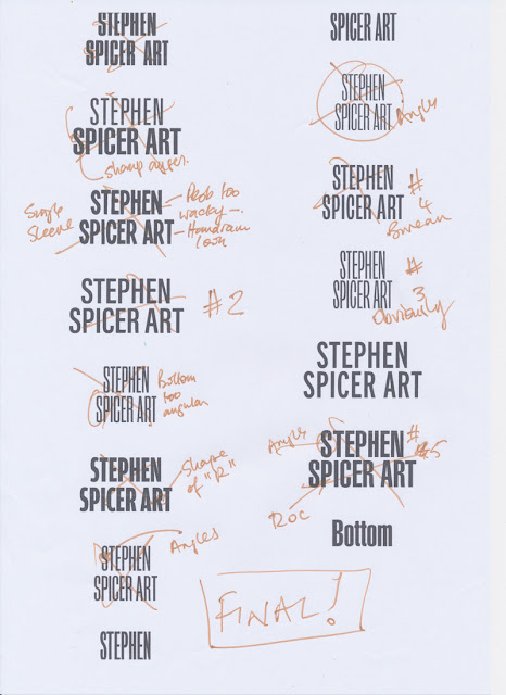


I force myself to compare one with the other. Eventually I end up with "Interstate", no doubt inspired by the clear typography on US roads. It comes in 36 weights. 
I'm not a big fan of Adobe TypeKit fonts. You only have them for the length of your CC subscription. Since I'm planning to wind that down over the next year or so, it's not a good policy to base long term projects on. Still, I'm just using it for this time so it's OK. I'll no doubt rework it (and the website) if I decide to keep it.

Lightbulb moment

I can't make it work still. Close, but no cigar...  Then I realise that if I use the word "Artist", not art, then it becomes easy.

Illustrator

So type is set up in Illustrator. There's some tracking and kerning needed but it fits, and nearly three hours in I want it to end. 
Here's the type in Illustrator. Currently it's RGB black. You can see the type controls.


Next stage is to make it white and add a black outline for clarity. Except this won't be an outline, it will be an inline to preserve the shapes. If you compare the two following screenshots you can see how the true outline makes the letter spacing go awry.Once again, getting bogged down on detail...

Outline version note the P.


Inline option. Much better.


Now to add a bit of colour. Added the red to the name and tested. It's a bit overpowering and send the wrong message:


Swapped them over. Fed up with the time this has taken, but pleased that I care enough. Used this version - almost!
Have, for the moment shrunk it a little. Works well on mobile, still not that good on Desktop. But that's a problem for another day.


Thursday, 14 May 2020

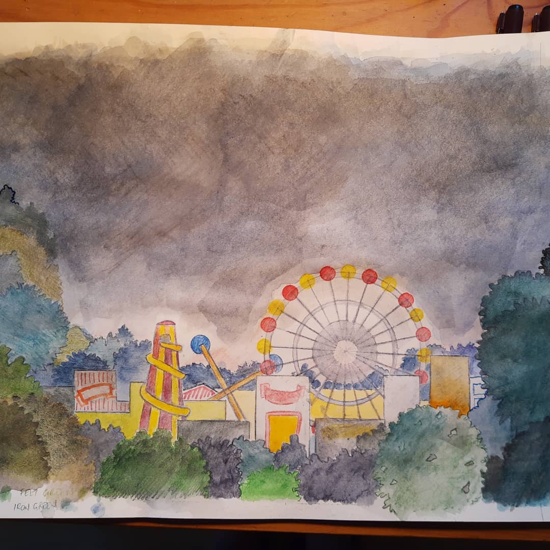
Fairground, working on drawing.

Got some colour in it now. Working on and layering colour. Going to scan it now, have decided to ink it i and use pencils. fence to ba added, but that is a operate file and will be added in photoshop Contrast not high enough when small. Which it will be.


One of three things on the go at the same time. Progressed from yesterday.Do a bit, paper now very wet, wait to dry, erase unwanted marks, do another bit. Derwent inktense watercolour pencils. Lots of layering. 


Here's the pencils

The rough for the client. Literally back of an envelope...


Sunday, 3 May 2020

Untitled/Forest video/Documentation


This is a short clip of the automata in action. The machine recognises the proximity of a person and if they are moving. If it detects movement, then the creatures hide. This is indicated by switching off their eyes. After a random amount of time 20 - 120 seconds, if no further movement is detected then they slowly come on again, first red then white. Any movement will cause an immediate shutdown. The delay and the sensitivity can be adjusted.


Base unit, upside down. PIR sensor at the front behind the grill. This has the effect of limiting the range and the angle of the sensor. Since I got this bit back to front (and realised after I had glued it) this effect was a fortunate mistake. Sensor should have been mounted through the round hole. Putting it there when I realised the mistake would have entailed making the whole thing again, so I lived with it. 

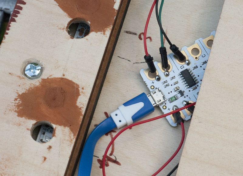
The automata uses fibre optics for piping light to the creature's eyes. Illumination is in the base, using addressable LEDs and a Crumble micro controller. This controller is intended for school use and is easy to use. You can find out more here.

PIR sensor. 


Crumble controller soldered in place. On the left are the LED. Because of the construction mistake, the holes needed to be moved. At this point I would have remanufactured it, but time was running out.

Reflection

This was a long struggle. Technically, what should have been easy turned out to be a struggle with delays and mistakes. By the time of the January assessment, I decided to let things go. But after that the desire to get it finished kicked back in. Programming the Crumble is easy, soldering the surface mount LEDs something my eyes aren't up to.
Compromises were made and the device rolled out for an audience in late February. It was put in the Street in a dark corner and left for a day. Feedback was encouraging and the delay time dropped, otherwise people thought it had simply stopped working.
My own opinion was mixed. I thought I had achieved something, but the message (if there is one) and the ability to hang a 'fine art' label on it worrying. I am encouraged by reading books such as "Thingworld" and visiting websites such as https://refugeeweek.org.uk/events/shahre-farang/ which highlights artist Farhad Berahman's work with peep shows that I am finding a practice. 
I am also encouraged by the reaction from people who wouldn't naturally inhabit a fine art show; my work is intended to invoke feelings of wonder and delight, but also curiosity and ask questions. The work here doesn't do the last criteria very well; but maybe it does. Subtlety isn't my strong point.


Tuesday, 28 April 2020

Synoptic Gospel Installation (Speculative)


Goals and Objectives 

I have been fascinated (blame HACS!) by the relationship between art and spirituality. I am also intrigued by the many representations of Jesus on film. Wikipedia/IMDB list some fifty screen representations of the aspects of the life of Christ - all different, all reflecting different points. My project, like a theological apologetic is to try and compare and reconcile these together; and in that process show a bigger picture that combined may illuminate an unseen aspect. The audience could be varied. Importantly, it is not aimed at the true believer and would include controversial material, such as the ‘Last Temptation” and ‘Life of Brian’. This is an installation that uses filmed narratives of the gospel to create a super narrative. A number of filmed reconstructions of the life of Christ are played simultaneously. Each one is synchronised with the other when they are either re-inacting the same event, supposedly at the same time or where the dialogue largely fits. Where it doesn’t then the film is paused. That way each fills in detail/creates story where it is lacking in others. Overall, I have identified more than 50 films/plays about Jesus, my estimation would be for the performance to run for around 15 hours.

Significance:

Manipulating and using existing film in a new and creative way has long been done. For example 24 Hour Psycho created by artist Douglas Gordon in 1993, and works by BillViola. Having this play out may have a strong emotional impact on an audience; I see people walking between screens as they attempt to follow the story. Where possible, images would be life sized. 

Project Plan 

This is a speculative project. To realise it, rights would have to be sought, many agreements made. It would need a huge space and be expensive to run. 

Conclusion

One area yet to be investigated is if this could be condensed down to a single edited film. Places that could (1) afford, and (2) have the requirted space would include the Ackerman Gallery in Saumur, France.


Updated image with figures to indicate size.

Sunday, 26 April 2020

Rough drawings for speculative artworks

A large pillar covered in minute highly coloured plants and animals is present in the middle of a mirrored room,  occasionally the pillar spins and strobe ultra violet lights illuminate it. At that point the 3D printed pillar comes alive along with the room. The room is for a short time converted into a walk-in zoetrope. 


Not sure what this is titled yet, nor any of the others for that matter. The theme is privacy. Viewers move into a room/box that has plaster walls. Through holes made in the walls, interesting metallic creatures can be seen. These creatures will make holes in the wall if the viewer shares some private information with them. The reward for sharing your info is to see more of them and behind them, other people's info.  


Decrepit fairground. Setting for various automata inspired by fairground side shows. Also contains the only Ghost train where you might die.

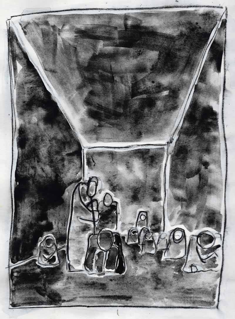
Dark space version one. This relies on proper selection of materials. There are human shapes in a large darkened room Because they are realised in stealth materials they are invisible from outside. An audience will only realise their existence by encountering them, for which they will have to move carefully. 


Dark space version two. This relies on proper selection of materials. There are human shapes on a large black(?) square. Because they are realised in stealth materials and a minor optical illusion is incorporated, they are invisible from outside the square. An audience will only realise their existence by encountering them. 

Escape the lockdown, spend time inside an escape pod. Or have a short break (3 mins to be exact) as all senses are stimulated.


Two images here. Neither fully worked out. Top one is a Fairground side show of a haunted house. Difference. This one is actually scary if I can get it to work.


Sky peepshow, this has been put up before, but this is a better scan.


Dissecting the Furby, part two...


stephen.d.spicer You may recall an earlier posting where I pulled a #Furby apart. This is one idea that sprang from that. What if it turned out they were actually flash and blood? This is a nearly finished bit of artwork. Was going to put it and actual bits in a museum-style case - but changing mind. Maybe it needs the videos posted earlier for effect - check the instagram link.

There's two versions of the text on these images. Still trying to work out best. Also images taken two ways. One at the top is a scan that's been joined up, the lower one here  is a photograph.


#bathspa #bath_bafineart #automata #furby #sculpture #art #bathspauniversity#woodandharrison #robot #toy #electronics #assemblageart #assemblage #biology #guts#art #bath_bafineart

Saturday, 25 April 2020

Fiddling around.

Actually, been busy today. Have got a number of images done, some of which I'll post tomorrow. Here's the one I did earlier. Sunny day, blue ink, see if some detail makes it better. All going well until I decided to extend the sky. Used the wrong blue.
So it's off to Photoshop to sort that out. Here's the result:


Still think it needs something on the street.

Wednesday, 22 April 2020

Serene, we rejoice in clean air and empty streets.


Piece done for The Broken Church  Creative Days project. "Each day for 50 days (Easter to Pentecost) there will be a new creation in response to the previous days creation. Each creator only see’s what they are responding too when it goes live here…" I had to react to an Imaginary Landscape by Ange Drozfrom who had done day 10. You have from the time it appears to the following late afternoon to react. Of course, I forgot all about it until about three in the afternoon, or to be more precise, I had a rough idea in the morning but didn't sit down in front of the white sheet of paper until three...


Realisation

The image is drawn with, as usual, Derwent Inktense water colour pencils, which are hydrated and then an eraser is used to get rid of the outlining pencil and any unhydrated Inktense. On this occasion I also went over with traditional watercolour - time was running short. 
I had intended to also strengthen and detail the lines with blue ink, but I ran out of time. Maybe I'll do that later; but on the whole I'm not too distressed at the submitted image. 


Title

"Serene, we rejoice in clean air and empty streets." is a longer title. I wanted to reflect on the fact that on the whole I'm enjoying this time. I don't mind queuing for 15 mins for an emptyish supermarket, I like the fact the roads are clear and you can breath. I had to go to the Doctor today for a blood test - it's on the other side of town. I drove back the long way, usual very busy and, so I'm told, some of the worst polluted air in the UK. Today, no traffic, fast journey, sunshine. Good to be alive. 


Reflection

Maybe I'll draw the details in. I'm not sure it needs it. The image is scanned however, so the version here won't be totally lost. Next time I'll draw it bigger and probably take more time to work out a correct perspective. I'll also pay more attention to the scale.
Colours are OK, using real watercolour again, instead of watercolour pencil or acrylic paint has reminded me that I'm in control here and the colours are better than the pencils on the whole. 
I need to pay more attention to the figures. They were alright but they were rushed and didn't quite work.I should have done more sky.

Saturday, 18 April 2020

More Sky.


Close up rough of 'Sky' that I put up a couple of days ago. Clouds part to see sun, birds fly past all warm and glowing. Sun goes down, moon comes up. Rocket fly's past. Clouds cover up again.
In a dark room with cloud/sky projections. Box in middle is a Peepshow/diorama that is filled with clouds and mysterious flying objects. Some of these escape... #sculpture #diorama #art#bathspauniversity #bath_bafineart#automatamagazine #automata #skyline#cloudscape #peepshow #arcade #vintage#penandink #pencil #teastain #inktensepencils#derwentinktense #derwentartists#colouredpencils #sun #moon


Wednesday, 15 April 2020

Sky automata/sculpture about flying and peace.


This called 'Sky' at the moment. Dark room with cloud/sky projections. Box in middle is a Peepshow/diorama that is filled with clouds and mysterious flying objects. Some of these escape...

One of the things I can't build at the moment, So another "Speculative Automata" for the Museum.