Showing posts with label graphic design. Show all posts

Sunday, 31 May 2020

Quick Logo? Never a quick logo...

Had to put together a website for University work. You can see it here. It's done in Wordpress and I'm still not that fond of Wordpress - or any other template driven web authoring process. (I know that Blogger would fall under that heading - but I don't care how the blogs look - much.
Template needed a logo. Instructions were absent, but a bit of experimentation established that it requires a square logo to fill the space.
Since I want to keep it simple, decided to just use text.
That was my downfall.

Trying out fonts

I was looking for something tall, narrow, sans-serif. Not to angular. In the old days of Letraset, that would have been Compacta, and I quite like that 60s font. I have a digital Compacta, so I tried that.
And when that didn't quite work for me, all the rest. Then, when they didn't work, online to Typekit and download every, and I mean every, font they have.
Set up the words "Stephen Spicer Art" in each one. Some are easily eliminated, but many are not.
Here's the first short list:


What's becoming clear is that I'm worrying about the shape of the uppercase "S". On Many of these fonts it's quite angular, and I want a more cursive one. (By this time I'm about 90 mins into this operation.) 
I eliminate some and then put the type into blocks as you can see below. I'm now nearly two hours into this and getting frustrated with myself for fretting about very small details.


I force myself to compare one with the other. Eventually I end up with "Interstate", no doubt inspired by the clear typography on US roads. It comes in 36 weights. 
I'm not a big fan of Adobe TypeKit fonts. You only have them for the length of your CC subscription. Since I'm planning to wind that down over the next year or so, it's not a good policy to base long term projects on. Still, I'm just using it for this time so it's OK. I'll no doubt rework it (and the website) if I decide to keep it.

Lightbulb moment

I can't make it work still. Close, but no cigar...  Then I realise that if I use the word "Artist", not art, then it becomes easy.

Illustrator

So type is set up in Illustrator. There's some tracking and kerning needed but it fits, and nearly three hours in I want it to end. 
Here's the type in Illustrator. Currently it's RGB black. You can see the type controls.


Next stage is to make it white and add a black outline for clarity. Except this won't be an outline, it will be an inline to preserve the shapes. If you compare the two following screenshots you can see how the true outline makes the letter spacing go awry.Once again, getting bogged down on detail...

Outline version note the P.


Inline option. Much better.


Now to add a bit of colour. Added the red to the name and tested. It's a bit overpowering and send the wrong message:


Swapped them over. Fed up with the time this has taken, but pleased that I care enough. Used this version - almost!
Have, for the moment shrunk it a little. Works well on mobile, still not that good on Desktop. But that's a problem for another day.


Friday, 12 April 2019

Deciding fonts 2019 Bath Fringe Guide Day One

There was a day zero. Trying out stuff, seeing what was what, waiting for material to start to flow. That was earlier this week. Various issues, like the printer failing at a critical time. Yes, I'm a pro, so I had a spare and got a replacement within 12 hours, but still a pain.

Today is day one.

I have been presented with a wonderful cover with handwritten type. I have been trying to get something close to the handwriting so I can use it in the rest of the guide. Here's the writing:


Never going to get an exact match, but here are some candidates:


Note the shape of the lower case "a" and the uppercase "J" Having looked at them and printed them out, I've shortlisted these two.


Top one is called Bubkis (https://www.dafont.com/dk-bupkis.font); the lower one, Grandstander (https://www.dafont.com/grandstander.font). I also like the one above Grandstander, which is called Dr Soos (https://www.dafont.com/doctor-soos.font).
Bubkis is a commercial font. Costs about £10-15 at the time of writing. The other two are vaguer when it comes to licensing. In both cases it says donate to author. So if I go for one of those, I'll make a donation around the same order of magnitude.

What's next

Once this has been decided, then I'm going to artwork a couple of pages using last year's text. It will be an opportunity to try out the design and test it technically, that is to make sure it's going to print next week.

***UPDATE 01/11/2022***

Just heard from Sophia, she mentions another good resource. I agree, it's here: https://www.websiteplanet.com/blog/best-free-fonts/

Thank you Sophia.

Thursday, 5 April 2018

Deciding fonts


Fretting about #fonts. Drawing a #map for #bathfringefestival Need to decide font. Narrowed it down to eight, from around 30. Rejected some on legibility issues, all were not expensive to licence.

Want it to look like a paper cut. Was going to use Lasercutter, but I think I've run out of time on that and will have to fake it. Got to be legible, fit the style, simple outlines. Here's the two I have narrowed it down to. Which would you choose?


Friday, 29 January 2016

Quick Tutorial in Photoshop Masking

Here's the screenshots from a Tutorial I did yesterday about Masking in Photoshop. Incidentally, if you see a mistake, please let me know in the comments!

 So what is masking? This is a layer mask.
The mask consists of an additional channel to the  layer.
For my demo I supplied the files, but to make this work amy image will do.

I filled this with a colour. If you use black or white then you won't be able to see any mistakes.


Any normal brush. Try novelty ones for something different!
See if you had used a black fill and you made a mistake - you wouldn't be able to see where you had gone wrong
For the avoidance of doubt that is HIDE the layer.


here's a demo using some sample files.


Great thing about a mask. Nothing is actually deleted. Make sure you save in Photoshop format. (PSD)

Wednesday, 17 June 2015

Font that time forgot.

I haven't seen this used for years. In fact, I don't think I've seen it outside of on-line volumes of freaky fonts since I last used it in 1972. I had a job for the summer at the New Life Centre in Bromley, Kent.

They had a sheet of rub-down letters (Like Letraset) in this font. I used it for a couple of jobs until we ran out of letters. The font was from Meccanorma, it's called Poster, and has been re-released

For you younger people out there - before the advent digital type we had three kinds of type in the main:

1. Phototypesetting, where people had very expensive machines with the letters on spinning disks usually. Setting was very expensive, I recall paying £25-40 an A4 page in 1980. Our typesetters had Berthold equipment. The disk looked like this. If I recall correctly, we had 10 founts to choose from.

2. Rub down lettering, such as Letraset. Each year I would excitedly get the new Letraset catalogue when it was released. It was an acquired skill to be able to put down a line of type that was straight and correctly spaced. I got more than one job in the early days that way. It also taught me a lot about letter spacing and legibility.
3. The IBM typesetter, based on a posh, complex and very expensive typewriter. Here's a picture of one. This used a carbon ribbon to give you clean type and best of all you could produce centred and justified text with it. Typefaces were interchangeable by lifting out the 'Golfball' that had the letters on it.

Here's a picture of one of the typefaces - although it should be noted this is just for the regular electric typewriter, it's a monospaced Elite.

All of the magazines and design jobs I worked on from leaving college until early DTP systems arrived used these - or a combination of these to produce print for reproduction by off-set litho.

Along with this, the artwork need to be generated by cutting and sticking to produce clean artwork. I was a very early adopter of DTP systems. When I started to freelance people wouldn't accept computer generated artwork, so I reverse engineered it to look like it had been done by hand.

Now days all of this is history. Producing 'real' artwork long gone. Even from today's stand point doing "mechanicals"; hand done stuck together artwork, is a short blip between 800 years of letterpress and the rise of computer based systems. I guess for professional artwork it was only around from 1968 - 1989 really.

Monday, 1 June 2015

One of my favourite packaging pictures

So, I like prawns, ships, lobsters and crabs. Both to look at, draw and have for lunch.

I think this simple drawing of a prawn, found on the front of a packet of uncooked prawn crackers is absolutely superb. Just makes me a bit happy to look at.

Prawn crackers were good as well, you can cook in Microwave - although they are very much better in hot oil, and expend to about 10x original size.

The local oriental supermarket sells these and some darker ones that are very strongly flavoured, for most people that I tested them on, too strong...

Tuesday, 26 May 2015

Experimenting with type.

 This is the finished product. If you're quick they will be around the streets of Bath over the next few days. It's a flyer for Bedlam Fair, which is a celebration of street theatre.
I wanted a slightly home=brewed retro look to the product. Initially I was going to propose using Letterpress or Risograph printing rather than offset/digital, but in the end this didn't happen because everything began running late. I did start to to a Linocut version of a map of Bath but this this was abandoned because it's almost impossible to update. (Although actually drawing the route on each of the flyers did also occur.
In the end I used a Photoshop Plug-in to give some of the images - notably the map and the Bedlam Fair masthead a retro look. This plug in replicates the look of cheap printing and provides a large number of controls to make the fakery look realistic. Of course, for the proper effect I would have had to use it on the whole publication, which was probably going to be unacceptable, so I didn't.

 This is a shot of the inside. here you can see the final layouts and colours.

Choosing Type
To achieve the look, whilst retaining the part of the brief that says "simple and easy to read" required some experimentation, testing and repeating the exercise and drilling down until a combination had been found. Of course, this is how I choose type - it's a long-winded process if I do it properly, but if it's for a series of similar products then if I get it right I can avoid having to re-do it every time a job comes along.

 For this job I basically need two or three typefaces: 
  • A display face for the main titles, and possibly another for subheadings.
  • A body type. I've already decided that I want a typewriter face for the body type - so the first job is to try a number. 
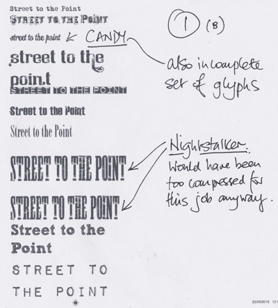
Must have tried around 50 display faces - the picture here is just a sub-set. Of the ones I liked, three were protected, meaning they couldn't be embedded into a pdf, which makes them useless. Nights taker was far too compressed for the size I wanted anyway. Candy turned out to be trial. Nice fnt, but quite expensive for just a few lines and the 'free' version I have has a very incomplete glyph set.
The same was true for "Mother Typewriter" and I noticed looking at the paragraphs of body type that I had the same face with three different names.

Here you can se some of the typewriter faces. Traveling Typewriter soon becomes the front runner. Not too grungy, has pretty complete glyph set. My other favourite, 1942 Typewriter,   has incomplete glyphs and doesn't work well at smaller sizes.
So here's a sheet of trials mixing up body and display. The Dymo like font has gone in and out of favour. I'm warming to it because it gives a fairly solid bar of colours. Useful for separating out sections.

Sketch Rockwell/Block (Name depends on where you get it from. - see this post) is liked by nearly all testers; but eventually dropped as it doesn't play well when used small. It also takes up a lot of space.
 More test, this time beginning develop and use colours. I've invented four, later six colours.

They are called:

  • Mucky Cyan: c90/m0/y20/k10
  • Mucky Magenta: c10/m90/y0/k10
  • Mucky Yellow: c20/m10/y75/k0
  • Flat Black: c20/m20/y10/k80


Later I added:

  • Dirty Red: c0/m90/y90/k10
  • Grubby Green: c50/m0/y75/10
These colours are desinged to simulate a poorly maintained press colours with loads of cross-conyamination. Additionally, as you can see from the front cover, I also simulated mis-registration. (bet this is going to make a printer look twice).
As you can see from the sheet here, at the end of this iteration one body style and one headline style were eliminated.

 This is the black version to check legibility
Here  you can see mucky Cyan working with a distressed display font. I quite like this, as do the testers, except for the spacing between the lowercase n and t. This face however is soon eliminated as it turns out we only have lower case and that is incomplete. Should have checked earlier!
One particular concern is how these work at smaller sizes. This test leads onto a later test, but already the writing is on the wall for some fonts.
Really like the effect of the Dymo lettering font in colour. Think it works well. But it's eliminated as too many heading will have to go onto two lines, or it will be too small to be read easily.
 Final two sheets of experiments. Been about three hours now - maybe longer if you count lunch and passing them around the table.
we have too winners; Veneer and Traveling Typewriter, The fancy type face that is the runner up will be saved for some heading (it was dropped in the end) the green became blue/cyan because that worked better.
If you enlarge this page you can see my notes as they were being passed around about the various typefaces.

Incidentally, I think it's pretty important, if this is going to be print, that these are printed out and looked at on paper. Most ink jet printers now give you a good idea of what's going on.

And finally, here's a rough of the layout, printed out and marked up for Saturday/Sunday.