Monday 7 December 2015

Colouring nearly done.

Four hours gone and I have painted the rocks and 245 carrot noses. There's still some pencil shading to be done and a look by the cool light of day for bits I've missed. The major elements to be done are a sky; which I'll paint separately and drop in, and I will hue shift the brown mountains to an indigo blue colour.
Right now I could go on all night, but common sense says "Quit while you're ahead"

Sunday 6 December 2015

Ink and colour tests.

Tried a number of different blues/pens. None of them gave exactly what I was looking for - a waterproof blue. Also tried pencils but not happy with finish. Considered drawing in brown then doing a hue shift. But that would rule out paint. However I have done a hue shift in another posting.

Us. Including cat.

Of course we're here. Although Ruth looks like she's got a beard. That will need to be fixed in post production.

This isn't the finished version, just a quick fix. You can see the hue shift working for the background. The brown has been changed to blue. I thought this worked rather well. 

Christmas cards cometh...

That's nearly all the drawing down. Quicker than last year, only two days down there at the moment, but the colour and digital work still to come.

This is just a bit.

Monday 2 November 2015

Lytro, nice idea for stereoscopic pictures, but no cigar....

I got quite excited at the idea of one of these cameras for 3D shots, especially when the original cameras are going for less than £100 at the moment.
What attracted me was the chance of using them to produce 3D shots from the information captured and using the newish Lytro software.
I downloaded the software and also download the Lytro sample files. This is the one I chose, because if it could show the background through the rain drops it would be impressive.
Unfortunately the 3D conversion, that seems to rely on a generated depth map didn't produce what I had hoped for, although I expected the card boarding that comes with the narrow interocular .
Looking closely at the pattern of rain-drops, it appears that some thing has happened.
Whether this is bad retouching, or a side effect of the Lytro software I'm not sure.
Here's the image in three dimensions.

Friday 23 October 2015

On-Photocopy show

So this is an exhibition that invites people to think about the Photocopier as a means of production. It's run by Fringe Arts Bath, and my interest was raised when I saw that video entries were allowed. Couldn't really at first see how you could incorporate video into Photocopies, but then was struck by the idea of using an old clip art book as the basis of an animation and also making it photocopiable by using the frames as the basis of a flick book.

The clip art book incidentally is the same one that Jack Vettriano used to get the figure shapes for the painting "The Singing Butler". I believe he got some flak for that - but that's what these books were produced for back in the 70s and 80s.
Here's the first experiments. Having told a class only this week I rarely use filters in Photoshop, here I am trying a number out to see how they work on the figures. I've already photocopied them from the book, scanned the copies and they are now in Photoshop. The plan is to modify the colour a little and maybe use some of the filters to rough it up a bit. Firstly I'm using levels to bump up the contrast. The copies are a little flat and at the size of the flick book they will be hard to see.

The next picture here is different effects applied to the cut out images. To be honest I don't much like any of them. I thought I would go for the one in the middle where I have imposed an additional layer of half-tone dots - but the dots are difficult to apply and crude at the size things need to be. I'm using a derelict ballroom image I got from Wikipedia as a background. I thought the original was terrific and captured the idea of displacement - the theme quite well and the paper ballroom dancers will be like ghosts forever dancing around. You can see the original here.

Once look of both the dancers and the background had been decided they were brought into Flash for animation. I had planned originally to do all the animation using paper cut outs - but figured I'd like a life and couldn't see that being done in under some considerable time.  Even so the slow dancers were time consuming to animate, you can see a bit here; basically there were not enough intermediate poses to get a smooth slower animation so I used fades and small colour shifts to add interest.

Flash gets a bad press now days. A lot of web people are a bit sniffy about it and there's no doubt it was overused a few years ago. But it's still great for many things, animation being one of them.


Here's the final result, at least the small gif version. The full version is 40Mb, which will be a nasty downloading surprise for someone if I post it.

Next is to do the flick book. When that's done I'll post a link and see if anyone downloads it and makes it up.

Making flick book for a show. First trial

So, this didn't work as well as expected. Ho. Hum. Forgot that when you export from Flash, it doesn't render the movement in the symbols when you're making a gif.
You have to export as video, then open the video in photoshop. Render to layers, render layers to animation and then it exports to an animated GIF. You can see the final result here

Sunday 4 October 2015

Installing Fonts into InDesign. Typekit fonts.

This is quite easy. Firstly find your font. There are many sources, but two main ones if you are reluctant to spend money -  Typekit, although it seems free is part of your Creative Cloud subscription, so isn't really free. There are two blog posts covering the subject of 'free' fonts. This one and another here on 'free' downloadable fonts.

Installing fonts from Typekit


If you have a Creative Cloud subscription, then getting a well-made, complete font is easy. In your application go to"typeset" fonts

 This will take you to the Typekit page. Spend a happy time either looking for the font you need, or finding a font that a job needs to finish. For this demo I choose a distressed font.
 Here it os Almag Rough, the font I choose. Clicking on this takes me to the product page...
 Here's the font with it's properties listed. These are labels just like Blogger!
I now ask it to load the font. I get this screen that says "Sync Fonts" - Typekit fonts will disappear if I cancel my subscription.

 Finally, this screen pops up to tell me that it's there. No need to restart the software, it's ready to go.
Here's the font in use in InDesign. Sharp-eyed students will recognise the worksheet.

How to download a 'free' font into InDesign

This is quite easy. Firstly find your font. There are many sources, but two main ones if you are reluctant to spend money - although it should be noted that paid-for fonts are nearly always superior to free ones. Typekit, although it seems free is part of your Creative Cloud subscription, so isn't really free, is covered in this post.

Free fonts from everywhere on the web


Firstly you need to find your font. If all you have is a name, then that's going to be difficult as you may be looking for a similar font that has a different name. Most sites give you a preview and the top ones you find in Google - as shown here are usually safe. Note the use of the word "usually"; you should never attempt this if the computer you are using doesn't have some form of active threat management. (College computers do.) I usually use Dafont to start.
Here I am in DaFont. I'm looking for a distressed font - DaFont calls these eroded. The three pictured here have various rights the authors are allowing you. It's important that you realise that you could be on the wrong end of a copyright dispute if you don't adhere to the terms. Don't say I'll never get caught; people do and end up out of pocket. (Also note there are differences between USA and EU/UK law on copyright - in a nutshell it's easier to get you here.)
In the picture:
A. Is OK to use commercially if you make a donation (and it's usually small) to the author.
B. This is a demo. The font will have all kinds of restrictions - probably best avoided.
C. OK for non-commercial use. May have technical restrictions - you should check before use.

When you click download (On a Mac and using safari, other computers/browsers will differ) you will get a zipped file. This will expand to give you a folder.


When the folder is expanded you may find the following in it:

  • Read me file - see below
  • Two image files
  • The font itself. In this case it's an OTF - Open Type Font that will work on Macs and PCs. 


This is the Read me file. It contains a number of bits of info which in this case render the font unsuitable for use without paying a fee - exactly what the author intended no doubt. These are:

  1. You can only use this for personal use - assume this means college as well as purely personal.
  2. Insisting you should pay if you want it in any type of commercial setting. Fair enough.
  3. Killer line. As this is a demo, the glyph set is minimal. no kerning table is present and you can't embed the font. That means you can't use it properly in Illustrator, make it into a PDF, or use it in any application where fonts need to become part of the document.
  4. Where you go for more information on licensing. 
Installing the font on a Mac. Double click, it will open as you see here. Click install font.


Font Book will open. It will check the font for suitability and see if there is a duplicate. IMPORTANT!! Strongly suggest you abandon if it flags an issue. Ignore these messages and you are only storing up woe for yourself.


Now your font is ready for use. Go to InDesign and check the fonts list it should be there. 


Have a look in the Glyphs panel. Here we can see the full glyph set for this font. As you can see in the picture here - and by comparing it with other fonts there's a lot of glyphs missing. This will give you woe when you use the font if you are not careful.


Here you cab see the effect of the missing Glyph. There's no bullet, so InDesign has used the substitute character.


Having said all of that most free fonts are OK, expect the "@" symbol, pound signs, and lowercase letters to missing and don't use them for important work unless throughly tested. 

If you *do* get stuck, there's an escape route - possibly. More about that in another blog post...

Wednesday 30 September 2015

Making a 3-Fold DL leaflet

This is one of the most common leaflets that you may find yourself doing. The Three-fold DL leaflet is found everywhere; Doctors surgery, Tourist racks, council offices. They are relatively simple to do, but also easy to get wrong. Most of these issues cover the set up, so that is what is covered here.
There are three ways to set up this leaflet, which you want to use is decided by:
  • Ease.
  • Attention to the tiny details.
  • Flexibility.

I will show you each way and then you can choose. The DL leaflet is basically one third A4 and when folded correctly fits nicely in a DL envelope - hence the name. Art working it requires art working six panels and then delivering it as a flat A4 sheet to the printer.

First decision

You need to decide how you are going to fold this. I am showing you the set up for a roll fold, but there’s the possibility of a Z fold as well. Your fold decides the order of panels and I strongly suggest that you make a dummy up before you go too far. These two folding methods are shown here.


Method one, which is easy, not so accurate, not flexible. can be used for Z or roll fold.

In InDesign, use the set up shown below, 99mm for each section:

You’ll need two pages in your file for this to work. Use the create guides menu item to divide up the pages as thirds. Then add extra guideline - I used 8mm here, to give you the margins. Because this isn’t 100% accurate, make sure that you don’t put any vital material within 5mm of the outside edges.

Artwork away!

Method two, which is requires accurate measuring, not flexible. Roll fold only.

This is similar to the above, so I won’t detail it. In essence this allows for the fold that the printer needs to do and the trimming. Each fold takes about 1mm, so we allow for that by making the two outside panels 100mm, but the inside 97mm. From the outside this looks like the diagrams below.
Is it worth it? For some things yes, and if you wanted to have more than three panels then absolutely as the panels will shrink as you fold. However for just two folds, unless things are critical, then I personally don’t worry other than allowing for the fact the inside flap is going to be a bit shorter and any issues about images going right to edges. Folding machines aren’t perfect anyway. The two images below show the differences


Just to add to the issue, here’s a different take on this:


Method Three. Flexible, bit more tricky, suitable for roll or Z fold.

This is my preferred method. Because all the panels are separate pages, it means If I make an error - or someone want to change things then I can do that easily. Not 100% accurate, although in theory InDesign, through its variable page size setting would allow for that.

Stages
First define the panel/page: 99 x210. note we are setting up all six panels.


This will give you six pages. Next we are going to make those into spreads. To do this select one page and in the pages panel set “Allow pages to shuffle” to off. 


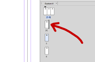
Little square brackets will appear 
Then drag up two more pages to the first and that will make the spread. 

When your panel is in the correct place a long square bracket will appear. 


The nice thing about this process is that you can drag the pages in your document around if you change your mind. Also, it makes doing an online PDF version easy.
You pages palette should look like the image here when you have done all of them.
Now you can artwork away. 


How the pages are seen.
The pages will fold like this if it’s a conventional roll-fold. The page numbers refer to the indesign page numbers. Note if you shuffle the pages, then they will adopt the number for their new position:
Page 1: Inside flap
Page 2: Rear
Page 3: Front
Pages 4-6: Spread, 


or:
Page 4: left hand spread.
Page 5: Middle
Page 6: Inside flap - hidden when opened initially.


Printing or making a PDF

Unless you actually want to print the leaflet as separate page, then you must make sure to check the SPREADS button in PDF and print dialogue boxes.


Some notes:

  • By law you should have a printer/publisher’s address. Not always followed, but can get you large fine if political material.
  • Page six, inside flap is where the form, if there’s one often goes.
  • If your leaflet is going in a rack, then only the top third or less will be visible.


Monday 13 July 2015

Tomorrowland, more interesting stuff...

The marketing for Tomorrowland just got better, more interesting - less puzzling.

Found this website this morning:  http://takemetotomorrowland.com

There's things to explore, the whole Plus Ultra thing is opened up a bit and it's all wrapped up in an interactive 360 degree high resolution environment.

As usual it is relentlessly optimistic, forward looking and incorporates that child-like, uncynical vision of the future that the film has.

In some ways it also has that creepy feeling that I got after five days at Disney world some years ago. A corporate intensity, but also blandness. Almost a feeling of a religion or a large political gathering where breaking the rules was unthinkable - why would you want to do that?

That said, it's still a masterpiece of marketing.