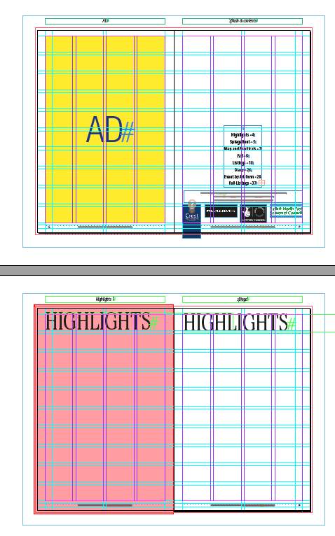
 Work continues on the Bath Fringe Festival guide. I got some of the copy yesterday, although I haven't got any pictures yet which makes doing layouts a bit pointless. Still entering text in the right places, deciding on typefaces, colour count and finding a new/different way to do the map will all fill up today quite nicely. Here's a screen shot before any text was added, you can also see the new typeface I may use: Century Schoolbook.
There's forty pages in all. Tomorrow morning I will spend a lot of time getting the type right. Once I've done that I'll set some InDesign styles so that I can apply them as I go through the text. Styles will make the whole process a lot quicker - and if change is needed, make it easier to do globally.
 In fact everything will be governed by a style as much as possible. Not only the text, but also the frames that hold pictures. tables, shadows. Anything that can be a style will be. InDesign allows styles to control character, paragraphs, text frames, picture frames, strokes, cells and tables in your document. It's the secret to getting your document to be consistent throughout. It also means that a job I do every couple of months that's a lot of fiddly styling can be done economically - which means the charity concerned get a nicely designed mailing without it costing the earth,
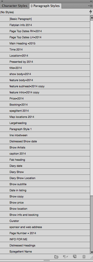
Here's the style sheets for the last Fringe guide. This year I shall edit them which will save hours - rather than create them from scratch.
No comments:
Post a Comment