Today's job is going through pictures and adverts. There are a high number of images from many different sources. When they come from people I know well then I don't always go through this process - but when they have been supplied by any number of different individual and organisations, many of whom won't know the technical or legal implications of what they are supplying then usually it pays to open up each one, make some changes where required and re-save. That way I can often save myself and a client from an issue later in the production process.
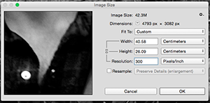 This is a screen shot from photoshop that shows a file with plenty of pixels in it. This one came in at a huge size, nearly a metre wide at 72ppi*. I'm using Photoshop's image resize function - but with resample switched off. This means that it changes the numbers but doesn't actually resample the image. Changing it this way and setting it at 300ppi means that when it is imported to InDesign that it will come in at a nice size/resolution ratio. It also means that I know I can increase the size a bit without worrying about having the pixels visible on the final product. The file is then saved out as a PSD (Photoshop native) file for placing into InDesign.
Pictures come in all sizes and labelled in ways that can be confusing or just plain wrong. This picture, which I bet looked OK on the web page they took it from is way too small. Resized it's going to be about the size of a postage stamp. If I have to use it then I will double up the size and add some imitation grain to cover up the blurriness of the photo. Frankly it's pretty much unusable - but it's the kind of issue you can miss if you are just placing straight into InDesign and not paying too much attention, as the file size (200k) should have been a big alarm bell ringer.
This year most pictures have been 'print' and 'web' versions. In about 50% of cases these pictures were more or less identical and both too low-res for print. About 25% too small. All in all around 200 pictures to go through.
Why 300 ppi?
Most times you will hear people quoting 300 ppi for print production. If you ask them why it is likely that this is something they heard and they just kept doing it.
Truth is there's nothing particularly magical about 300 ppi. The rule of thumb used to be that the process screen resolution - that is the half-tone screen that will generate the small dots we print with - had to be 50% of the size of the scan to avoid complications.
Often a 150#** screen is used in commercial print, so 300 makes sense. Trouble is through:
- At the time people first started talking about 300ppi, the common screen was 133#.
- Modern screens are higher 175# - 200#
- Conventional square dot screens are falling out of favour anyway, being replaced by scholastic screens which use random dots in clusters.
My theory about 300 is simple. It was the highest available resolution for the first few generations of scanners, so simply we are grabbing the best quality we can. Now days I'd prefer 400ppi, and I always scan my own pictures at 600ppi, 48 bit and then use Photoshop to sort out the file.
* PPI=pixels per inch. as opposed to DPI which can mean a number of things and can be confusing.
** The # symbol means line screen here.
No comments:
Post a Comment