Showing posts with label font. Show all posts

Friday, 12 April 2019

Deciding fonts 2019 Bath Fringe Guide Day One (Part 2)

Grandstander (https://www.dafont.com/grandstander.font) wins!! Not only is it free to use, although I will make a donation to the creator, but it has a very complete Glyph set. The large Glyph set means that there shouldn't be an issue with not having the correct character.

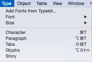
In InDesign, if you want to see the Glyphs, it's TYPE > GLYPHS. In modern versions, the alternates pop up as well.


Deciding fonts 2019 Bath Fringe Guide Day One

There was a day zero. Trying out stuff, seeing what was what, waiting for material to start to flow. That was earlier this week. Various issues, like the printer failing at a critical time. Yes, I'm a pro, so I had a spare and got a replacement within 12 hours, but still a pain.

Today is day one.

I have been presented with a wonderful cover with handwritten type. I have been trying to get something close to the handwriting so I can use it in the rest of the guide. Here's the writing:


Never going to get an exact match, but here are some candidates:


Note the shape of the lower case "a" and the uppercase "J" Having looked at them and printed them out, I've shortlisted these two.


Top one is called Bubkis (https://www.dafont.com/dk-bupkis.font); the lower one, Grandstander (https://www.dafont.com/grandstander.font). I also like the one above Grandstander, which is called Dr Soos (https://www.dafont.com/doctor-soos.font).
Bubkis is a commercial font. Costs about £10-15 at the time of writing. The other two are vaguer when it comes to licensing. In both cases it says donate to author. So if I go for one of those, I'll make a donation around the same order of magnitude.

What's next

Once this has been decided, then I'm going to artwork a couple of pages using last year's text. It will be an opportunity to try out the design and test it technically, that is to make sure it's going to print next week.

***UPDATE 01/11/2022***

Just heard from Sophia, she mentions another good resource. I agree, it's here: https://www.websiteplanet.com/blog/best-free-fonts/

Thank you Sophia.

Thursday, 5 April 2018

Deciding fonts


Fretting about #fonts. Drawing a #map for #bathfringefestival Need to decide font. Narrowed it down to eight, from around 30. Rejected some on legibility issues, all were not expensive to licence.

Want it to look like a paper cut. Was going to use Lasercutter, but I think I've run out of time on that and will have to fake it. Got to be legible, fit the style, simple outlines. Here's the two I have narrowed it down to. Which would you choose?


Thursday, 3 August 2017

Fonts, important, but brain ache..

Have spent the last two hours trying find a suitable comic book font. I have decided that I don't want to actually do the lettering myself as it will almost certainly require changes.
In the process of looking I found this little chart at https://jasonthibault.com/comic-book-fonts/
It shows how to letter a balloon correctly, and notes the difference between the use of a capital "I" as in myself and where it appears in the middle of a word.

Actually, for my students who are interested in comic book publishing, the whole article is worth reading and full of good advice.
The links to the fonts will also be of interest as they are all useful.

My main gripe is that most of them only come in three weights, Regular, Italic and Bold italic. I'm not sure if I will need a Bold. But it would be nice to know it's there to be used.

Some fonts


In addition to the free for small press commercial use, I've also been looking at Paid fonts. Overall I looked at about 20, narrowed that down, drew up a chart to help narrow it down further and ended up the ones below. Prices are 25-30 Dollars, so that's not going to be a factor. I guess I should look at Adobe's typeset, but I don't recall having seen anything.
Now I'm going to sleep on it. Try out what I've already got (See last picture and take it from there.


Probably Sequentialist is the winner, as it has Regular, Italic, Bold and Bold Italic. The other two have lowercase letters through, so there's a choice to give the type 'colour' and to differentiate between the parts of speech and thought.

Any opinions welcome.


Demo page I set up for myself. Too many choices...

Sunday, 4 October 2015

Installing Fonts into InDesign. Typekit fonts.

This is quite easy. Firstly find your font. There are many sources, but two main ones if you are reluctant to spend money -  Typekit, although it seems free is part of your Creative Cloud subscription, so isn't really free. There are two blog posts covering the subject of 'free' fonts. This one and another here on 'free' downloadable fonts.

Installing fonts from Typekit


If you have a Creative Cloud subscription, then getting a well-made, complete font is easy. In your application go to"typeset" fonts

 This will take you to the Typekit page. Spend a happy time either looking for the font you need, or finding a font that a job needs to finish. For this demo I choose a distressed font.
 Here it os Almag Rough, the font I choose. Clicking on this takes me to the product page...
 Here's the font with it's properties listed. These are labels just like Blogger!
I now ask it to load the font. I get this screen that says "Sync Fonts" - Typekit fonts will disappear if I cancel my subscription.

 Finally, this screen pops up to tell me that it's there. No need to restart the software, it's ready to go.
Here's the font in use in InDesign. Sharp-eyed students will recognise the worksheet.

How to download a 'free' font into InDesign

This is quite easy. Firstly find your font. There are many sources, but two main ones if you are reluctant to spend money - although it should be noted that paid-for fonts are nearly always superior to free ones. Typekit, although it seems free is part of your Creative Cloud subscription, so isn't really free, is covered in this post.

Free fonts from everywhere on the web


Firstly you need to find your font. If all you have is a name, then that's going to be difficult as you may be looking for a similar font that has a different name. Most sites give you a preview and the top ones you find in Google - as shown here are usually safe. Note the use of the word "usually"; you should never attempt this if the computer you are using doesn't have some form of active threat management. (College computers do.) I usually use Dafont to start.
Here I am in DaFont. I'm looking for a distressed font - DaFont calls these eroded. The three pictured here have various rights the authors are allowing you. It's important that you realise that you could be on the wrong end of a copyright dispute if you don't adhere to the terms. Don't say I'll never get caught; people do and end up out of pocket. (Also note there are differences between USA and EU/UK law on copyright - in a nutshell it's easier to get you here.)
In the picture:
A. Is OK to use commercially if you make a donation (and it's usually small) to the author.
B. This is a demo. The font will have all kinds of restrictions - probably best avoided.
C. OK for non-commercial use. May have technical restrictions - you should check before use.

When you click download (On a Mac and using safari, other computers/browsers will differ) you will get a zipped file. This will expand to give you a folder.


When the folder is expanded you may find the following in it:

  • Read me file - see below
  • Two image files
  • The font itself. In this case it's an OTF - Open Type Font that will work on Macs and PCs. 


This is the Read me file. It contains a number of bits of info which in this case render the font unsuitable for use without paying a fee - exactly what the author intended no doubt. These are:

  1. You can only use this for personal use - assume this means college as well as purely personal.
  2. Insisting you should pay if you want it in any type of commercial setting. Fair enough.
  3. Killer line. As this is a demo, the glyph set is minimal. no kerning table is present and you can't embed the font. That means you can't use it properly in Illustrator, make it into a PDF, or use it in any application where fonts need to become part of the document.
  4. Where you go for more information on licensing. 
Installing the font on a Mac. Double click, it will open as you see here. Click install font.


Font Book will open. It will check the font for suitability and see if there is a duplicate. IMPORTANT!! Strongly suggest you abandon if it flags an issue. Ignore these messages and you are only storing up woe for yourself.


Now your font is ready for use. Go to InDesign and check the fonts list it should be there. 


Have a look in the Glyphs panel. Here we can see the full glyph set for this font. As you can see in the picture here - and by comparing it with other fonts there's a lot of glyphs missing. This will give you woe when you use the font if you are not careful.


Here you cab see the effect of the missing Glyph. There's no bullet, so InDesign has used the substitute character.


Having said all of that most free fonts are OK, expect the "@" symbol, pound signs, and lowercase letters to missing and don't use them for important work unless throughly tested. 

If you *do* get stuck, there's an escape route - possibly. More about that in another blog post...

Wednesday, 30 September 2015

Making a 3-Fold DL leaflet

This is one of the most common leaflets that you may find yourself doing. The Three-fold DL leaflet is found everywhere; Doctors surgery, Tourist racks, council offices. They are relatively simple to do, but also easy to get wrong. Most of these issues cover the set up, so that is what is covered here.
There are three ways to set up this leaflet, which you want to use is decided by:
  • Ease.
  • Attention to the tiny details.
  • Flexibility.

I will show you each way and then you can choose. The DL leaflet is basically one third A4 and when folded correctly fits nicely in a DL envelope - hence the name. Art working it requires art working six panels and then delivering it as a flat A4 sheet to the printer.

First decision

You need to decide how you are going to fold this. I am showing you the set up for a roll fold, but there’s the possibility of a Z fold as well. Your fold decides the order of panels and I strongly suggest that you make a dummy up before you go too far. These two folding methods are shown here.


Method one, which is easy, not so accurate, not flexible. can be used for Z or roll fold.

In InDesign, use the set up shown below, 99mm for each section:

You’ll need two pages in your file for this to work. Use the create guides menu item to divide up the pages as thirds. Then add extra guideline - I used 8mm here, to give you the margins. Because this isn’t 100% accurate, make sure that you don’t put any vital material within 5mm of the outside edges.

Artwork away!

Method two, which is requires accurate measuring, not flexible. Roll fold only.

This is similar to the above, so I won’t detail it. In essence this allows for the fold that the printer needs to do and the trimming. Each fold takes about 1mm, so we allow for that by making the two outside panels 100mm, but the inside 97mm. From the outside this looks like the diagrams below.
Is it worth it? For some things yes, and if you wanted to have more than three panels then absolutely as the panels will shrink as you fold. However for just two folds, unless things are critical, then I personally don’t worry other than allowing for the fact the inside flap is going to be a bit shorter and any issues about images going right to edges. Folding machines aren’t perfect anyway. The two images below show the differences


Just to add to the issue, here’s a different take on this:


Method Three. Flexible, bit more tricky, suitable for roll or Z fold.

This is my preferred method. Because all the panels are separate pages, it means If I make an error - or someone want to change things then I can do that easily. Not 100% accurate, although in theory InDesign, through its variable page size setting would allow for that.

Stages
First define the panel/page: 99 x210. note we are setting up all six panels.


This will give you six pages. Next we are going to make those into spreads. To do this select one page and in the pages panel set “Allow pages to shuffle” to off. 


Little square brackets will appear 
Then drag up two more pages to the first and that will make the spread. 

When your panel is in the correct place a long square bracket will appear. 


The nice thing about this process is that you can drag the pages in your document around if you change your mind. Also, it makes doing an online PDF version easy.
You pages palette should look like the image here when you have done all of them.
Now you can artwork away. 


How the pages are seen.
The pages will fold like this if it’s a conventional roll-fold. The page numbers refer to the indesign page numbers. Note if you shuffle the pages, then they will adopt the number for their new position:
Page 1: Inside flap
Page 2: Rear
Page 3: Front
Pages 4-6: Spread, 


or:
Page 4: left hand spread.
Page 5: Middle
Page 6: Inside flap - hidden when opened initially.


Printing or making a PDF

Unless you actually want to print the leaflet as separate page, then you must make sure to check the SPREADS button in PDF and print dialogue boxes.


Some notes:

  • By law you should have a printer/publisher’s address. Not always followed, but can get you large fine if political material.
  • Page six, inside flap is where the form, if there’s one often goes.
  • If your leaflet is going in a rack, then only the top third or less will be visible.


Tuesday, 26 May 2015

Experimenting with type.

 This is the finished product. If you're quick they will be around the streets of Bath over the next few days. It's a flyer for Bedlam Fair, which is a celebration of street theatre.
I wanted a slightly home=brewed retro look to the product. Initially I was going to propose using Letterpress or Risograph printing rather than offset/digital, but in the end this didn't happen because everything began running late. I did start to to a Linocut version of a map of Bath but this this was abandoned because it's almost impossible to update. (Although actually drawing the route on each of the flyers did also occur.
In the end I used a Photoshop Plug-in to give some of the images - notably the map and the Bedlam Fair masthead a retro look. This plug in replicates the look of cheap printing and provides a large number of controls to make the fakery look realistic. Of course, for the proper effect I would have had to use it on the whole publication, which was probably going to be unacceptable, so I didn't.

 This is a shot of the inside. here you can see the final layouts and colours.

Choosing Type
To achieve the look, whilst retaining the part of the brief that says "simple and easy to read" required some experimentation, testing and repeating the exercise and drilling down until a combination had been found. Of course, this is how I choose type - it's a long-winded process if I do it properly, but if it's for a series of similar products then if I get it right I can avoid having to re-do it every time a job comes along.

 For this job I basically need two or three typefaces: 
  • A display face for the main titles, and possibly another for subheadings.
  • A body type. I've already decided that I want a typewriter face for the body type - so the first job is to try a number. 
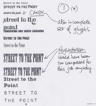
Must have tried around 50 display faces - the picture here is just a sub-set. Of the ones I liked, three were protected, meaning they couldn't be embedded into a pdf, which makes them useless. Nights taker was far too compressed for the size I wanted anyway. Candy turned out to be trial. Nice fnt, but quite expensive for just a few lines and the 'free' version I have has a very incomplete glyph set.
The same was true for "Mother Typewriter" and I noticed looking at the paragraphs of body type that I had the same face with three different names.

Here you can se some of the typewriter faces. Traveling Typewriter soon becomes the front runner. Not too grungy, has pretty complete glyph set. My other favourite, 1942 Typewriter,   has incomplete glyphs and doesn't work well at smaller sizes.
So here's a sheet of trials mixing up body and display. The Dymo like font has gone in and out of favour. I'm warming to it because it gives a fairly solid bar of colours. Useful for separating out sections.

Sketch Rockwell/Block (Name depends on where you get it from. - see this post) is liked by nearly all testers; but eventually dropped as it doesn't play well when used small. It also takes up a lot of space.
 More test, this time beginning develop and use colours. I've invented four, later six colours.

They are called:

  • Mucky Cyan: c90/m0/y20/k10
  • Mucky Magenta: c10/m90/y0/k10
  • Mucky Yellow: c20/m10/y75/k0
  • Flat Black: c20/m20/y10/k80


Later I added:

  • Dirty Red: c0/m90/y90/k10
  • Grubby Green: c50/m0/y75/10
These colours are desinged to simulate a poorly maintained press colours with loads of cross-conyamination. Additionally, as you can see from the front cover, I also simulated mis-registration. (bet this is going to make a printer look twice).
As you can see from the sheet here, at the end of this iteration one body style and one headline style were eliminated.

 This is the black version to check legibility
Here  you can see mucky Cyan working with a distressed display font. I quite like this, as do the testers, except for the spacing between the lowercase n and t. This face however is soon eliminated as it turns out we only have lower case and that is incomplete. Should have checked earlier!
One particular concern is how these work at smaller sizes. This test leads onto a later test, but already the writing is on the wall for some fonts.
Really like the effect of the Dymo lettering font in colour. Think it works well. But it's eliminated as too many heading will have to go onto two lines, or it will be too small to be read easily.
 Final two sheets of experiments. Been about three hours now - maybe longer if you count lunch and passing them around the table.
we have too winners; Veneer and Traveling Typewriter, The fancy type face that is the runner up will be saved for some heading (it was dropped in the end) the green became blue/cyan because that worked better.
If you enlarge this page you can see my notes as they were being passed around about the various typefaces.

Incidentally, I think it's pretty important, if this is going to be print, that these are printed out and looked at on paper. Most ink jet printers now give you a good idea of what's going on.

And finally, here's a rough of the layout, printed out and marked up for Saturday/Sunday.