Tuesday, 28 April 2020

Eight songs for John Wood.

For JW, a list of the eight songs/albums for a Desert Island. Note you click the headings to take you to recording.

Layla • Derek and the Dominos

Reminds me of summer 1971. Her name was Claire, she was an actress. Went on to be famous. As soon as I hear the opening notes I'm transported back to the YMCA, Portsmouth, and her. 

Purple Haze • Tangerine Dream version 220 volt Live

I have listened to Tangerine Dream since getting their first album and playing it very loud. This is actually very straight for them. Most of it is experimental electronic. But this is, for me, better than Hendrix.

Joy • After the Fire

I've known Peter Banks the keyboards player since I was a teenager. Still know him. This was the song they opened their gigs with. It still gives a thrill. I photographed them, and loads of other bands at the time, including many punk bands. Unfortunately I lost most of the negatives many years ago.

Children of the Grave • Black Sabbath

Been a Sabbath fan for years, second or third album I brought. Not sure what my missionary parents thought of it. Probably they thought it wise not to comment. Was challenged at a bike show years ago "C'mon, you're one of those God-botherers, choose a Sabbath song. (Big grin on DJ's face!) . Choose this song. Pretty good message I thought, shows Ozzie's background.


42nd Street
My favourite 1930s musical. Lots of competition, but I think this sequence sums up the era. Magic. 


No More Heroes • Stranglers
Another one that sums up a time in life.


Electricity • Captain Beefheart
Took some time to get into the Captain fully, but the strange vocals, the druggie sounds, and his manic voice.


Aqua • Edgar Frose
Firstly, to get the full effect, you need to listen on headphones. Frose was a pioneer in binaural recording and this is the first one he did. It's all about experimentation, pushing boundaries. Which we all need to do.


Also ran close...


These were considered.

Can't you hear the song they're singing. Jeremy Spencer and the Children

So, in my teens I joined what would be known as a cult later and not a good one. But my time there was mostly positive but I left when the clouds began to darken the skys. Jeremy Spencer also joined and did this album. The song takes me back to those days when things were black and white and simple. Sometimes I miss that.


Something from an Organ

I get this from my Father, who loved organ music. We had a small one at home. I never learned to play not, and to be honest he wasn't an expert. But organ music is still one of the classical forms that I find deeply moving - especially in the right situation. Caterbury Cathedral is one place.


This is pretty good as well..

Synoptic Gospel Installation (Speculative)


Goals and Objectives 

I have been fascinated (blame HACS!) by the relationship between art and spirituality. I am also intrigued by the many representations of Jesus on film. Wikipedia/IMDB list some fifty screen representations of the aspects of the life of Christ - all different, all reflecting different points. My project, like a theological apologetic is to try and compare and reconcile these together; and in that process show a bigger picture that combined may illuminate an unseen aspect. The audience could be varied. Importantly, it is not aimed at the true believer and would include controversial material, such as the ‘Last Temptation” and ‘Life of Brian’. This is an installation that uses filmed narratives of the gospel to create a super narrative. A number of filmed reconstructions of the life of Christ are played simultaneously. Each one is synchronised with the other when they are either re-inacting the same event, supposedly at the same time or where the dialogue largely fits. Where it doesn’t then the film is paused. That way each fills in detail/creates story where it is lacking in others. Overall, I have identified more than 50 films/plays about Jesus, my estimation would be for the performance to run for around 15 hours.

Significance:

Manipulating and using existing film in a new and creative way has long been done. For example 24 Hour Psycho created by artist Douglas Gordon in 1993, and works by BillViola. Having this play out may have a strong emotional impact on an audience; I see people walking between screens as they attempt to follow the story. Where possible, images would be life sized. 

Project Plan 

This is a speculative project. To realise it, rights would have to be sought, many agreements made. It would need a huge space and be expensive to run. 

Conclusion

One area yet to be investigated is if this could be condensed down to a single edited film. Places that could (1) afford, and (2) have the requirted space would include the Ackerman Gallery in Saumur, France.


Updated image with figures to indicate size.

Sunday, 26 April 2020

Rough drawings for speculative artworks

A large pillar covered in minute highly coloured plants and animals is present in the middle of a mirrored room,  occasionally the pillar spins and strobe ultra violet lights illuminate it. At that point the 3D printed pillar comes alive along with the room. The room is for a short time converted into a walk-in zoetrope. 


Not sure what this is titled yet, nor any of the others for that matter. The theme is privacy. Viewers move into a room/box that has plaster walls. Through holes made in the walls, interesting metallic creatures can be seen. These creatures will make holes in the wall if the viewer shares some private information with them. The reward for sharing your info is to see more of them and behind them, other people's info.  


Decrepit fairground. Setting for various automata inspired by fairground side shows. Also contains the only Ghost train where you might die.

Dark space version one. This relies on proper selection of materials. There are human shapes in a large darkened room Because they are realised in stealth materials they are invisible from outside. An audience will only realise their existence by encountering them, for which they will have to move carefully. 


Dark space version two. This relies on proper selection of materials. There are human shapes on a large black(?) square. Because they are realised in stealth materials and a minor optical illusion is incorporated, they are invisible from outside the square. An audience will only realise their existence by encountering them. 

Escape the lockdown, spend time inside an escape pod. Or have a short break (3 mins to be exact) as all senses are stimulated.


Two images here. Neither fully worked out. Top one is a Fairground side show of a haunted house. Difference. This one is actually scary if I can get it to work.


Sky peepshow, this has been put up before, but this is a better scan.


Dissecting the Furby, part two...


stephen.d.spicer You may recall an earlier posting where I pulled a #Furby apart. This is one idea that sprang from that. What if it turned out they were actually flash and blood? This is a nearly finished bit of artwork. Was going to put it and actual bits in a museum-style case - but changing mind. Maybe it needs the videos posted earlier for effect - check the instagram link.
There's two versions of the text on these images. Still trying to work out best. Also images taken two ways. One at the top is a scan that's been joined up, the lower one here  is a photograph.


#bathspa #bath_bafineart #automata #furby #sculpture #art #bathspauniversity#woodandharrison #robot #toy #electronics #assemblageart #assemblage #biology #guts#art #bath_bafineart

Saturday, 25 April 2020

Fiddling around.

Actually, been busy today. Have got a number of images done, some of which I'll post tomorrow. Here's the one I did earlier. Sunny day, blue ink, see if some detail makes it better. All going well until I decided to extend the sky. Used the wrong blue.
So it's off to Photoshop to sort that out. Here's the result:


Still think it needs something on the street.

Wednesday, 22 April 2020

Serene, we rejoice in clean air and empty streets.


Piece done for The Broken Church  Creative Days project. "Each day for 50 days (Easter to Pentecost) there will be a new creation in response to the previous days creation. Each creator only see’s what they are responding too when it goes live here…" I had to react to an Imaginary Landscape by Ange Drozfrom who had done day 10. You have from the time it appears to the following late afternoon to react. Of course, I forgot all about it until about three in the afternoon, or to be more precise, I had a rough idea in the morning but didn't sit down in front of the white sheet of paper until three...


Realisation

The image is drawn with, as usual, Derwent Inktense water colour pencils, which are hydrated and then an eraser is used to get rid of the outlining pencil and any unhydrated Inktense. On this occasion I also went over with traditional watercolour - time was running short. 
I had intended to also strengthen and detail the lines with blue ink, but I ran out of time. Maybe I'll do that later; but on the whole I'm not too distressed at the submitted image. 


Title

"Serene, we rejoice in clean air and empty streets." is a longer title. I wanted to reflect on the fact that on the whole I'm enjoying this time. I don't mind queuing for 15 mins for an emptyish supermarket, I like the fact the roads are clear and you can breath. I had to go to the Doctor today for a blood test - it's on the other side of town. I drove back the long way, usual very busy and, so I'm told, some of the worst polluted air in the UK. Today, no traffic, fast journey, sunshine. Good to be alive. 


Reflection

Maybe I'll draw the details in. I'm not sure it needs it. The image is scanned however, so the version here won't be totally lost. Next time I'll draw it bigger and probably take more time to work out a correct perspective. I'll also pay more attention to the scale.
Colours are OK, using real watercolour again, instead of watercolour pencil or acrylic paint has reminded me that I'm in control here and the colours are better than the pencils on the whole. 
I need to pay more attention to the figures. They were alright but they were rushed and didn't quite work.I should have done more sky.

Monday, 20 April 2020

Madonna, sketchbook work.

So this is a trial. Vaguely based on my memories of Leonardo's Virgin on the Rocks it is an experiment with grey-scale underpainting, followed by a set of coloured washes. Came out better than I expected. Drawing below is unfinished, as I went on, inspired by this to draw the other Madonna here - which got a huge amount of interest from the people who say it. That image started the same way but was finished with glitter gel pens.

Work in progress: Sky

This is a snapshot of the final drawing/painting being done for the Sky automata. It's beeb beset by mistakes - some due to trying to draw outside in bright sunlight where I couldn't really see what I was doing.
Others by rushing. Nevertheless, nothing that can't be fixed!

Work in progress: Serene and Crucifixion icons

The photos here shows both of these at an early stage. Because I was using Inktense watercolour pencils for the colouring, I did them together as you have to factor in drying time. These pencils are permanent once they are draw which means that you can pain over them without the under colour running. However on wood they have two issues which lead me to repainting the almost the whole thing.

Issues

First issue: I'm used to drawing all over the place, hydrating the bits that I want and then, when dry, erasing the unwanted stuff. This didn't work, the pencil was a sod to remove from the primer anyway and it didn't erase at all from the depths of the grain.
Secondly, the colour didn't take the way I want and some of the colours - the red for example, were just wrong.
So in the end I want over the whole thing with proper paint. You can see the results here and here

Saturday, 18 April 2020

More Sky.


Close up rough of 'Sky' that I put up a couple of days ago. Clouds part to see sun, birds fly past all warm and glowing. Sun goes down, moon comes up. Rocket fly's past. Clouds cover up again.
In a dark room with cloud/sky projections. Box in middle is a Peepshow/diorama that is filled with clouds and mysterious flying objects. Some of these escape... #sculpture #diorama #art#bathspauniversity #bath_bafineart#automatamagazine #automata #skyline#cloudscape #peepshow #arcade #vintage#penandink #pencil #teastain #inktensepencils#derwentinktense #derwentartists#colouredpencils #sun #moon


Thursday, 16 April 2020

Isolation Icon - Serene

I must think up some clever titles for these things. This is a a non-religious image - although some might still say spiritual. It's also obvious, which I don't like - rays coming from a head. Been done 1000s of times.
It's painted on wood. Foundation work was done with Derwent Inktense pencils over a primer of acrylic white Worked OK other than I can't erase unwanted lines - they will the spaces in the grain and lie there waiting to trash whatever else goes over. This isn't a problem on paper as long as you erase and clean up. Size is 150mm x 150mm. The smaller square is painted in reflective blue interference medium, which doesn't show up much on this scan. This shows a pearl blue on reflection, I have a tube of it, W+N don't appear to quite do the same item any more. Here's the nearest.

Inspiration

I liked the idea of the current CoronaVirus being a time out to collect thoughts and reappraise where one is in the world and where one want to go. Personally I'm calm; but then I have a small social circle and I don't see them every day. Most of all I miss my fellow students at Bath Spa - and the university.


Wednesday, 15 April 2020

Trial Icon.


One of a series of icons. Since it was done on Good Friday, it seemed appropriate. This is 150 x 150mm, the outer yellow part is actually golden, but you have to see it for real to get a sense of that. Painted on wood. Use Inktense pencils which proved to be an issue, as I can rub out unwanted lines on paper - but turns out, not on wood.

Off-site exhibition.

Had great plans for this at the beginning of the year. Make 4-5 automata, show them in a few places: Fringe Arts Bath, Greenbelt, somewhere else (Fairground?). Now due to the virus, things have to change. So sitting and thinking of new ideas. Guess it's going to be online, just wondering how to show.

Two ideas

One a satin show, like a gallery.


Another, make a VR show. Like that idea so I have taken a panorama to get an idea of what size it needs to be.


Huge! Original 70,000 pixels long...

Sky automata/sculpture about flying and peace.


This called 'Sky' at the moment. Dark room with cloud/sky projections. Box in middle is a Peepshow/diorama that is filled with clouds and mysterious flying objects. Some of these escape...

One of the things I can't build at the moment, So another "Speculative Automata" for the Museum.

Monday, 13 April 2020

From a comic, 1953...


No doubt, by now you know my love of old sci-fi comics - especially from the 1950s and earlier. This is from Weird Science (1953), and I thought this panel strangely prophetic. The colouring is 21st century, but it's pretty close. Makes it more readable.
These comics are full of WW2 references. This was later categorised as a 'horror' comic. I use these in lectures at college, they still have a power ro horrify that strongly, modern comics don't unless they really goover the top. I'm guessing that the writers and artists that created these had seen first hand, callousness and brutality; and real injured and dead people - in a way that most modern artists have never.
This story, by the way is about a man that can't help himself shrinking. So small that he finds himself as a giant on a miniature solar system on an atom. Hence the picture. He continues shrinking and finds that even atoms have atoms and these are also small worlds, and so the story goes on...


Sunday, 5 April 2020

icons and religious art.


Mother and child. Had Leonardo's Madonna vaguely in mind while doodling with glitter gelpens. Also thinking of last tutorial and discussing icons and religious art. There's a few things coming together here. #icon #madonna #art #gelpens #glitter #drawing #bath_bafineart  #bathspauniversity #workinprogress

Dissecting the Furby (Updated with video)

So the project has stalled. Wasn't sure it worked as a piece of art. Not sure about these drawings. Time to put it aside and have a long think.
The strongest part are the videos. Have a look at them here:


Beginnings

Got this Furby. It's an annoying thing because it eats batteries and keeps wanting to connect to it's App. The App then spends time trying to sell you things that don't exist. So I decided to dissect it and then present it was a real animal in a museum case.
Here's a couple of pictures:


Inside the Furby's head. To be exact it's brains. Still works if you connect it up and press sensors. Reminds me of Donavan's brain. Totally unaware that it has been removed.


This is the bit that holds the Furby's brain. So I'm painting it up to resemble a skull. Not finished yet, but already looking skull like. This is about the width of a smartphone screen (40mm) looks crude if you enlarge it.

Here's a still from Donovan's Brain (1953)


Odd things I found while trying to set up a studio.

So I have a victorian mahogany table that is in dire need of some love. To be honest, if they were collecting I'd donate it to the local furniture charity - although it may be in too poor condition.
So I have pulled it apart to see if it's worth repairing. Just about, mainly because I haven't got the cash for a cheap table from Ikea or somewhere. Ikea is also closed.
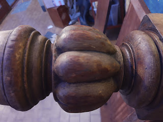
The first thing I found was this MH chalking on the bottom, - actually there's two - this was done by me when I was five or six - I'm guessing - my brother and I used to pretend we were mice and hide under the table while our Mother chased us. Cute huh?

More interestingly, there's this set of marks underneath. The table originally extended to double its length. This was so you could seat up to ten people. There were two extra pieces that slotted in. To do that there was a long screw that ran the length of the table underneath. I can vaguely recall my Dad removing this. 

There are several bodges underneath, probably his handiwork. My DIY skills are pretty terrible, but my Dad's were non-existent. I recall a home filled with half done project and holes. 


One of the legs


Here's a picture of the underside. You can see the damaged wood. I'm going to have one go a fixing it and then it's break up and reuse (unless the furniture project want it.)

Thursday, 2 April 2020

Another 3D pic. With instructions...

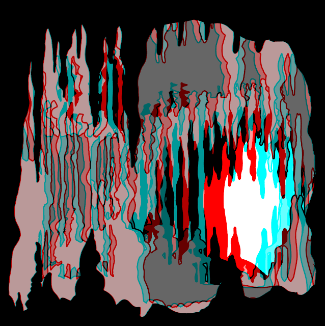
I think this version is the best. In the end I did about twenty different versions. There's another one at the end of this. Instructions follow...
So this is about creating the images you see here. The origin of tis one is a practical model I made for another student's show. The box is about 45mm wide, so if you're looking at this on a phone, it's about life size.

Here's how it was done:

Software: Adobe Illustrator, Photoshop. I assume you have some knowledge of these applications.
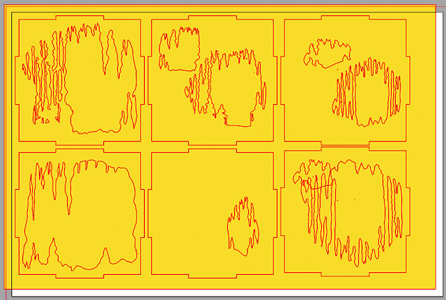
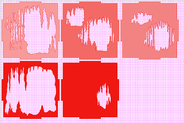
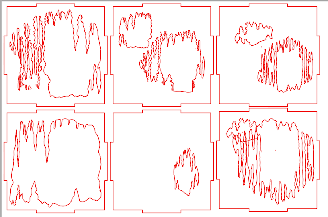
So, this is the Illustrator file that I got ready for the Lasercutter. There's a bit more, there are just the faces and I didn't use the one bottom right in the end. The missing parts are the sides and the top and bottom.

So, the Laser cutter needs just outlines, no fills. It also doesn't like Illustrator's compound paths or other Postscript trickery, so to prep the file for the Lser cutter I get rid of all of those. Unfortunately, for the 3D image we do need 'real' holes in the illustration, so these have to be put in. What you are looking at here is a yellow layer put behind everything so I can see that these are holes and not just filled with white.
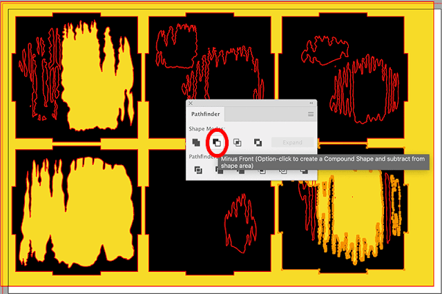
So, the box shapes have been filled with black. (See bottom middle) the whole group have been stroked (outlined) in red so I can see them. I'm then selecting each element in turn and using the Pathfinder to take the small shape from the big shape. This cuts holes in the shapes. An alternative that sometimes works is making the whole thing a Live paint object and filling with nothing. 
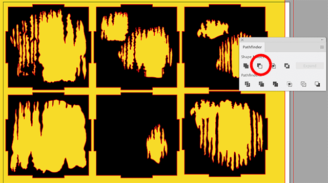
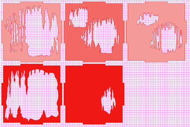
Here we are almost all done...
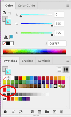
Now the fun begins. I have coloured these 100% RGB Red (255, 0, 0). Then switched to HSB, which allows me desaturate the colour without changing it. You can of course do this other ways. I'm using peak red as this is a colour that disappears nicely on cheap anaglyph glasses. Note; Illustrator works in CMYK by default. Switch the document to RGB!
So, make a copy on another layer and repeat the process. This time we are using Cyan as it is the complimentary to Red. Personally, I think Green works better, but you have to have Red/Green anaglyph glasses and they are harder to find. Cyan has issues- which I might do another blog post on at some time. (Grief this is taking me back to my first trip to art school where I first did experiments in stereoscopy..)  Here's me stroking the paths.
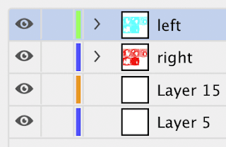
Here's a peek at the Illustrator layers. Doesn't matter much which way around they are.

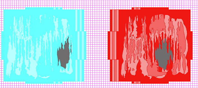
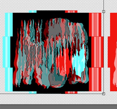
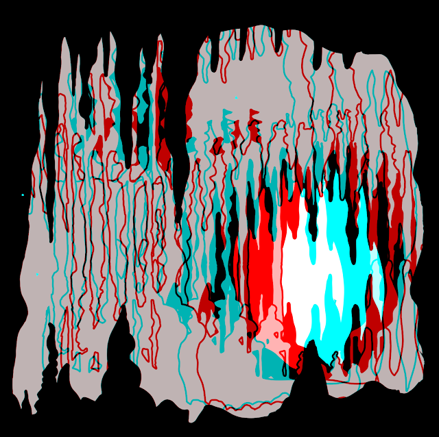
When you have done this, stack one channel on top of each other, despite this being the red, I stacked the blue because they are harder to see.
Here they are stacked. And HERE IS THE TRICK that will make them three dimensional. The stacks are slightly offset as you can see in this picture. here I've exaggerated the offset. In the working one it was much smaller and I experimented with different settings. I also swapped colours around, altered densities and so on. Probably about twenty experiments in all. But it's the offset that creates the illusion. You should also not that what works nicely at phone size may not work well at desktop or projection.
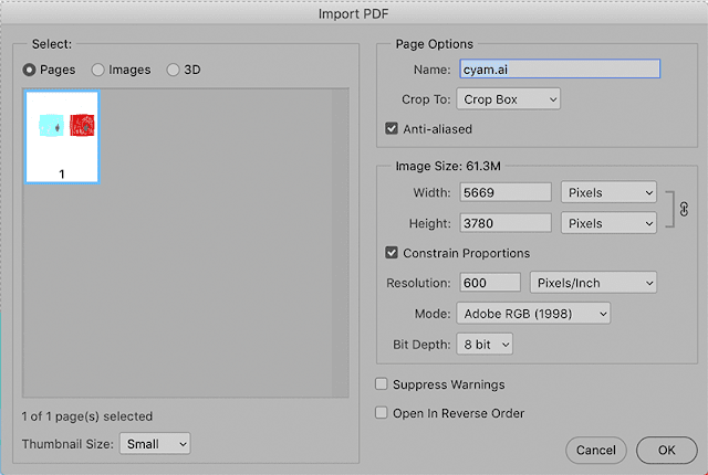
Once this has been done, open the Illustrator file in Photoshop. I use quite a high resolution, it's easy to downsize if you need to. You can see that Photoshop automatically flattens the file. 

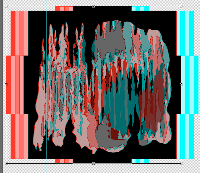
In Photoshop, copy one colour to a layered then align. You will need to experiment with this. Basically where the two layers align completely becomes the screen level. Other layers will appear on top or below this. What I do is just sit and tinker until it looks right.
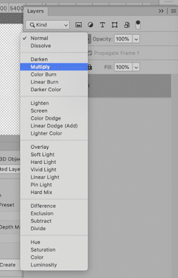
Very important!! Set the top layer to the Multiply setting in the blend menu in Layers. This simulates overprinting and the effect of transparent ink. Without this, you won't get the effect. Incidentally, you wouldn't do this is you wanted to print the image. This is for screen use.
Here's more-or-less the final version in Photoshop, at least, the technically final version, it's working now. You'll notice that I've swapped the cyan and red around so that it works with the glasses I have; although I could have simply worn the glasses around the other way.
And that's it, just about. Start simple, amuse yourself. Then you can go for more complex stuff.


this is the other version. I think the shaded version works bette, although there's an issue with the blue/cyan colour as the shading is very difficult to see.