Friday, 1 September 2017

Strangeness in the print costs.


So there's some strangeness in the prices for print. This is a small run, how small I'm not sure yet so I thought I would compare prices. Bit labourious, I know; but usually worth it. With care fun print buying you can save a lot of money. The secret is matching job to company.
Above you can see a graph of prices - they are all from the same company but different binding and quantity. Obviously hardback is more costly, but in a short run the lines are pretty straight. Not so softbound. Note the two kinks in the line and that actually hardbound is cheaper than softbound at some low quantities.
Also note that both softbound unit prices fall once you get 250. Probably a switch to a faster machine that needs a longer run through.
At the end of the day there's not much difference for short run in many cases. But sometimes the saving can be spectacular  if you allow the printer to dictate sizes and quantities.

Thursday, 3 August 2017

Fonts, important, but brain ache..

Have spent the last two hours trying find a suitable comic book font. I have decided that I don't want to actually do the lettering myself as it will almost certainly require changes.
In the process of looking I found this little chart at https://jasonthibault.com/comic-book-fonts/
It shows how to letter a balloon correctly, and notes the difference between the use of a capital "I" as in myself and where it appears in the middle of a word.

Actually, for my students who are interested in comic book publishing, the whole article is worth reading and full of good advice.
The links to the fonts will also be of interest as they are all useful.

My main gripe is that most of them only come in three weights, Regular, Italic and Bold italic. I'm not sure if I will need a Bold. But it would be nice to know it's there to be used.

Some fonts


In addition to the free for small press commercial use, I've also been looking at Paid fonts. Overall I looked at about 20, narrowed that down, drew up a chart to help narrow it down further and ended up the ones below. Prices are 25-30 Dollars, so that's not going to be a factor. I guess I should look at Adobe's typeset, but I don't recall having seen anything.

Now I'm going to sleep on it. Try out what I've already got (See last picture and take it from there.


Probably Sequentialist is the winner, as it has Regular, Italic, Bold and Bold Italic. The other two have lowercase letters through, so there's a choice to give the type 'colour' and to differentiate between the parts of speech and thought.

Any opinions welcome.


Demo page I set up for myself. Too many choices...

Scripting and Sketchbook

 These scans show the scripting process. This is quite early on and the page with the blur has been considerably shortened and reworked.
The blurred photo was taken out, and a number of identifiable components redacted.
I use cat and paste because for me it is faster and I put a value on speed of operation.
Often the pages in the script will have many layers of stuff stuck on them. Scribbles, quotes pages and sentences from the research that I have done. I started off with nearly 300 pages of research - 300 literally as I printed the bulk of them out.

Why print them out?

For me, once again this is quicker, also I can annotate them, draw on them, cut bits out and then re-assumble them.
All of which is slower and less intuitive than on a screen.
Also, I can lay out all the pages and shuffle them to get a good overview. On a screen you (well at least I do.) tend to just focus on one thing, which is why I try to get my students to use their sketchbooks. Incidentally, your handwriting will improve and secondly, no-one's going to be judging you on that in a sketchbook. Unless you're a Calligrapher.

This image, which was in the original show will probably go in as it is. Although I am wondering if I should massage it for a square format.
I've also noticed that several of the pictures are similar. So some new drawing/editing will be required.

Never finished first time around...

Here's the picture I'd never finished. Before and after, although 'after' isn't strictly true as it's still in progress. Need to add some lighting. Paint is still wet, so that's the reason for the reflection in the later version.
Originally drawn, but not finished in 2011


Some weeks later...

It's gone through a lot of drafts. Too many. Trouble was finding the glue to hold it all together and I don't think I'm really there yet. This week I started what I wanted to start a month ago, namely Illustration.
Dug out the old pictures - if all else fails, I have an exhibition here. Found one picture that I had forgot that I had, and another that was never finished. That last one is now on the production line for finishing.
Today Ruth is out for the day, so I'm hoping that I will start at least five pictures.
Tonight's effort takes shape. #grayanddismalgreen#greenbelt Gb17

Friday, 7 July 2017

Grey and Dismal Green - real first day.

Wrote, and I use the term lightly, the first draft of the Grey and Dismal Green script today. Cobbled together from some of Ruth's recollections and some of my copy and images; I believe there's enough to make a start.
Ruth is finding this hard as it's digging out memories. But there's a story that needs to be told in some form, and the deadline of 1st August isn't so far away.
Gulp!

Thursday, 23 March 2017

Producing Artwork for the Lasercutter

This is a guide to producing artwork (the type of artwork we are doing) for the Lasercutter. It's not a definitive guide, it's what I found that works and is simple for people to understand and use. I realise that as I write this it may be too simple for some applications. If that's you, please move on.

IMPORTANT: If you find an error, please let me know!!

How it works

You are setting up a file where you want the Lasercutter to carve or cut out shapes.

You are using the Lasercutter because it's:
  • Repeatable
  • Quick
  • Accurate
  • Cuts finer than you can with a Knife.

The Illustration.

Draw the picture. Use any tool you like - Photoshop, Illustrator, black ink on white paper.
In your drawing the white areas are areas that will cut out, the black areas will stay.
When you are drawing, remember that areas of black surrounded by white will fall out, so if they are to stay you will need to provide some support.

Open in Photoshop

Open your image in Photoshop. If it's ink on paper you will need to scan it. If it's Illustrator you can open it directly.

Make sure that it's the size you want and the resolution is at least 300ppi. 1200 will be too much.


In Photoshop, max the contrast so it's just black and white.
Notice I've checked the "Use Legacy" box. This means it will be just black and white.


Convert to greyscale. This last step may not be necessary - you are aiming for pure black and white and it may help.


In photoshop examine the image carefully. Iron out any bumps and clean up any stray pixels. 

Photoshop is the easiest place to do this.


Save your file as PSD.

Open Illustrator

Create a new file the correct finished size. 


Place the Photoshop file


Select Window > Image Trace


The Image trace window appears.


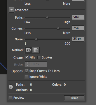
Click on "Advanced"


Click "Ignore white"


Make sure Preview is selected

View the image on the screen while you adjust the sliders. You are aiming for the smallest number of corners and paths that will still give you the image you require.

When you are happy, close the trace image window.


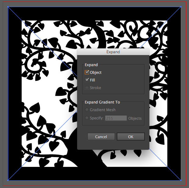
Select the traced image (if it's not already selected).

Select Expand.


Check the image by going to View > Outlines.

You should have clear paths. That is where the cutter will cut.


Choose export to DXF. Use the older settings (Our Lasercutter software doesn't understand the newer DXF settings from Illustrator.)


That's it!