Sunday, 31 May 2020

Quick Logo? Never a quick logo...

Had to put together a website for University work. You can see it here. It's done in Wordpress and I'm still not that fond of Wordpress - or any other template driven web authoring process. (I know that Blogger would fall under that heading - but I don't care how the blogs look - much.
Template needed a logo. Instructions were absent, but a bit of experimentation established that it requires a square logo to fill the space.
Since I want to keep it simple, decided to just use text.
That was my downfall.

Trying out fonts

I was looking for something tall, narrow, sans-serif. Not to angular. In the old days of Letraset, that would have been Compacta, and I quite like that 60s font. I have a digital Compacta, so I tried that.
And when that didn't quite work for me, all the rest. Then, when they didn't work, online to Typekit and download every, and I mean every, font they have.
Set up the words "Stephen Spicer Art" in each one. Some are easily eliminated, but many are not.
Here's the first short list:


What's becoming clear is that I'm worrying about the shape of the uppercase "S". On Many of these fonts it's quite angular, and I want a more cursive one. (By this time I'm about 90 mins into this operation.) 
I eliminate some and then put the type into blocks as you can see below. I'm now nearly two hours into this and getting frustrated with myself for fretting about very small details.


I force myself to compare one with the other. Eventually I end up with "Interstate", no doubt inspired by the clear typography on US roads. It comes in 36 weights. 
I'm not a big fan of Adobe TypeKit fonts. You only have them for the length of your CC subscription. Since I'm planning to wind that down over the next year or so, it's not a good policy to base long term projects on. Still, I'm just using it for this time so it's OK. I'll no doubt rework it (and the website) if I decide to keep it.

Lightbulb moment

I can't make it work still. Close, but no cigar...  Then I realise that if I use the word "Artist", not art, then it becomes easy.

Illustrator

So type is set up in Illustrator. There's some tracking and kerning needed but it fits, and nearly three hours in I want it to end. 
Here's the type in Illustrator. Currently it's RGB black. You can see the type controls.


Next stage is to make it white and add a black outline for clarity. Except this won't be an outline, it will be an inline to preserve the shapes. If you compare the two following screenshots you can see how the true outline makes the letter spacing go awry.Once again, getting bogged down on detail...

Outline version note the P.


Inline option. Much better.


Now to add a bit of colour. Added the red to the name and tested. It's a bit overpowering and send the wrong message:


Swapped them over. Fed up with the time this has taken, but pleased that I care enough. Used this version - almost!
Have, for the moment shrunk it a little. Works well on mobile, still not that good on Desktop. But that's a problem for another day.




Wednesday, 27 May 2020

Collaborating with other artists

Collaboration, we are told, and it's probably true, is a good thing. It's hard for people like me, who are used to being a bit of a loner; but generally it can be observed that the product is better for it.
Not everyone's input is useful. Collaboration amongst equals - or close to equals is good, but you can't really do good work if there is a big gulf in understanding or skill sets.
I know that's open to a lot of criticism, but everyone has an opinion; however, often these are not fact based and today often parroting someone else.

TO BE COMPLETED

Tuesday, 26 May 2020

Doing the research folder

So for assessment we have to do a research folder/pdf. Last time I submitted three loose leaf folders. That works for me since most of my notes are sketchbook or scribblings. I don't type much, it takes too long and it's not vital enough. Besides which I agonises over the typography.
This time around it has to be a PDF, I have no problems with PDF. In fact I once certified as an 'expert' in Acrobat/PDF. Adobe said there's lots of work for people who really understand PDF, and there was only one other certified expert (ACE). Never got a single job out of it...

InDesign

I'm using InDesign to generate this. I've set up a book document to hold all the sections and each section is separate InDesign document. That way it's easy to see what you have done - or not done. At the moment there's about 150 pages, which will generate a huge PDF - I will have to use severe compression to get that down.

At the moment I'm sorting through pictures. I have about 1000 I've taken over the last six months, and I need some as evidence. There's more to come, these are just the one from the phone.

In case you're wondering the pictures are from a small show of automata at Broughton-on-the-Water. They have little red question marks because I've moved them and InDesign has lost the link.


Friday, 15 May 2020

Finished... For the moment...


That's it for the moment. Got to add text - hence the bog space, but other than that, done. My be I'll add some stars, or the moon --or ----or....

Thursday, 14 May 2020

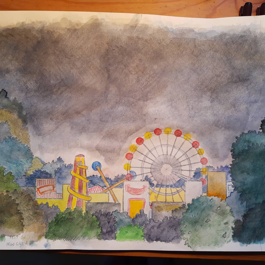
Fairground, working on drawing.

Got some colour in it now. Working on and layering colour. Going to scan it now, have decided to ink it i and use pencils. fence to ba added, but that is a operate file and will be added in photoshop Contrast not high enough when small. Which it will be.


One of three things on the go at the same time. Progressed from yesterday.Do a bit, paper now very wet, wait to dry, erase unwanted marks, do another bit. Derwent inktense watercolour pencils. Lots of layering. 


Here's the pencils

The rough for the client. Literally back of an envelope...


Monday, 4 May 2020

Walk-in Praxinscope


This is a speculative work that uses pre-cinema technology to generate movement from static objects on a grand scale. Effectively it is a walk-in Praxinoscope or Zoetrope.UYpon entry, the viwer finds themselve inside a mirrored room. In the middle there is a brightly coloured column that is covered in repeating patterns of flowers, insects, whatever. These are not flat, - rather they are 3D printed objects of great intricay.
When the machine starts, the coloum rotates, as do the mirrors, rotation is in opposite directions. At this point, observing the coloumn in the mirrors will show unexpeced movement from the sequential images. Sometime later the lights dim and first visible light and then UV lights strobe. This makes the movement on the column very precise and the combination of lighting reveals different colours and patterns.
This could be presented as a staged performance, or a walk-through. Alternatively, the device will work with a strobe, but without mirrors.

Significance:

Varrious artists have investigated and used pre-cinema ideas. There is a considerable body of work that I will reference in my research folder. I see this as the project shown, but perhaps on a far larger scale that will hold and excite an audience.

Project Plan 

No real project plan can be done realistically at the moment. However, it would be possible to build and explore a model as proof of concept and for testing. However, the main effect is scale; being inside rather than watching from outside.

Documentation/Examples

https://www.youtube.com/watch?v=B08T1A88IlQ
https://learn.adafruit.com/strobe-zoetrope
https://vimeo.com/198605915
https://vimeo.com/116709749
https://danielcwilson.com/blog/2018/08/optical-fun-zoetrope/