Things in progress. Finished things. Things that may be of use to others...
Saturday, 24 October 2015
Friday, 23 October 2015
On-Photocopy show
 So this is an exhibition that invites people to think about the Photocopier as a means of production. It's run by Fringe Arts Bath, and my interest was raised when I saw that video entries were allowed. Couldn't really at first see how you could incorporate video into Photocopies, but then was struck by the idea of using an old clip art book as the basis of an animation and also making it photocopiable by using the frames as the basis of a flick book.
The clip art book incidentally is the same one that Jack Vettriano used to get the figure shapes for the painting "The Singing Butler". I believe he got some flak for that - but that's what these books were produced for back in the 70s and 80s.
The next picture here is different effects applied to the cut out images. To be honest I don't much like any of them. I thought I would go for the one in the middle where I have imposed an additional layer of half-tone dots - but the dots are difficult to apply and crude at the size things need to be. I'm using a derelict ballroom image I got from Wikipedia as a background. I thought the original was terrific and captured the idea of displacement - the theme quite well and the paper ballroom dancers will be like ghosts forever dancing around. You can see the original here.
 Once look of both the dancers and the background had been decided they were brought into Flash for animation. I had planned originally to do all the animation using paper cut outs - but figured I'd like a life and couldn't see that being done in under some considerable time. Even so the slow dancers were time consuming to animate, you can see a bit here; basically there were not enough intermediate poses to get a smooth slower animation so I used fades and small colour shifts to add interest.
Flash gets a bad press now days. A lot of web people are a bit sniffy about it and there's no doubt it was overused a few years ago. But it's still great for many things, animation being one of them.
Here's the final result, at least the small gif version. The full version is 40Mb, which will be a nasty downloading surprise for someone if I post it.
Next is to do the flick book. When that's done I'll post a link and see if anyone downloads it and makes it up.
Making flick book for a show. First trial
So, this didn't work as well as expected. Ho. Hum. Forgot that when you export from Flash, it doesn't render the movement in the symbols when you're making a gif.
You have to export as video, then open the video in photoshop. Render to layers, render layers to animation and then it exports to an animated GIF. You can see the final result here
You have to export as video, then open the video in photoshop. Render to layers, render layers to animation and then it exports to an animated GIF. You can see the final result here
Sunday, 4 October 2015
Installing Fonts into InDesign. Typekit fonts.
This is quite easy. Firstly find your font. There are many sources, but two main ones if you are reluctant to spend money - Typekit, although it seems free is part of your Creative Cloud subscription, so isn't really free. There are two blog posts covering the subject of 'free' fonts. This one and another here on 'free' downloadable fonts.
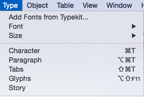 If you have a Creative Cloud subscription, then getting a well-made, complete font is easy. In your application go to"typeset" fonts
This will take you to the Typekit page. Spend a happy time either looking for the font you need, or finding a font that a job needs to finish. For this demo I choose a distressed font.
Here it os Almag Rough, the font I choose. Clicking on this takes me to the product page...
Here's the font with it's properties listed. These are labels just like Blogger!
I now ask it to load the font. I get this screen that says "Sync Fonts" - Typekit fonts will disappear if I cancel my subscription.
Finally, this screen pops up to tell me that it's there. No need to restart the software, it's ready to go.
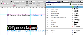
Here's the font in use in InDesign. Sharp-eyed students will recognise the worksheet.
Installing fonts from Typekit
 If you have a Creative Cloud subscription, then getting a well-made, complete font is easy. In your application go to"typeset" fonts
This will take you to the Typekit page. Spend a happy time either looking for the font you need, or finding a font that a job needs to finish. For this demo I choose a distressed font.
Here it os Almag Rough, the font I choose. Clicking on this takes me to the product page...
Here's the font with it's properties listed. These are labels just like Blogger!
I now ask it to load the font. I get this screen that says "Sync Fonts" - Typekit fonts will disappear if I cancel my subscription.
Finally, this screen pops up to tell me that it's there. No need to restart the software, it's ready to go.
Here's the font in use in InDesign. Sharp-eyed students will recognise the worksheet.
How to download a 'free' font into InDesign
This is quite easy. Firstly find your font. There are many sources, but two main ones if you are reluctant to spend money - although it should be noted that paid-for fonts are nearly always superior to free ones. Typekit, although it seems free is part of your Creative Cloud subscription, so isn't really free, is covered in this post.
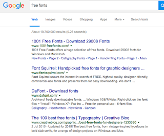 Firstly you need to find your font. If all you have is a name, then that's going to be difficult as you may be looking for a similar font that has a different name. Most sites give you a preview and the top ones you find in Google - as shown here are usually safe. Note the use of the word "usually"; you should never attempt this if the computer you are using doesn't have some form of active threat management. (College computers do.) I usually use Dafont to start.
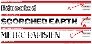 Here I am in DaFont. I'm looking for a distressed font - DaFont calls these eroded. The three pictured here have various rights the authors are allowing you. It's important that you realise that you could be on the wrong end of a copyright dispute if you don't adhere to the terms. Don't say I'll never get caught; people do and end up out of pocket. (Also note there are differences between USA and EU/UK law on copyright - in a nutshell it's easier to get you here.)
In the picture:
A. Is OK to use commercially if you make a donation (and it's usually small) to the author.
B. This is a demo. The font will have all kinds of restrictions - probably best avoided.
C. OK for non-commercial use. May have technical restrictions - you should check before use.
 When you click download (On a Mac and using safari, other computers/browsers will differ) you will get a zipped file. This will expand to give you a folder.

When the folder is expanded you may find the following in it:
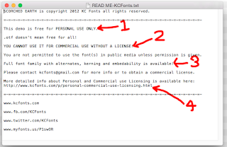 This is the Read me file. It contains a number of bits of info which in this case render the font unsuitable for use without paying a fee - exactly what the author intended no doubt. These are:
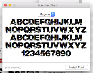
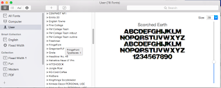 Font Book will open. It will check the font for suitability and see if there is a duplicate. IMPORTANT!! Strongly suggest you abandon if it flags an issue. Ignore these messages and you are only storing up woe for yourself.
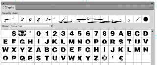 Have a look in the Glyphs panel. Here we can see the full glyph set for this font. As you can see in the picture here - and by comparing it with other fonts there's a lot of glyphs missing. This will give you woe when you use the font if you are not careful.
 Here you cab see the effect of the missing Glyph. There's no bullet, so InDesign has used the substitute character.
Free fonts from everywhere on the web
 Firstly you need to find your font. If all you have is a name, then that's going to be difficult as you may be looking for a similar font that has a different name. Most sites give you a preview and the top ones you find in Google - as shown here are usually safe. Note the use of the word "usually"; you should never attempt this if the computer you are using doesn't have some form of active threat management. (College computers do.) I usually use Dafont to start.
 Here I am in DaFont. I'm looking for a distressed font - DaFont calls these eroded. The three pictured here have various rights the authors are allowing you. It's important that you realise that you could be on the wrong end of a copyright dispute if you don't adhere to the terms. Don't say I'll never get caught; people do and end up out of pocket. (Also note there are differences between USA and EU/UK law on copyright - in a nutshell it's easier to get you here.)
In the picture:
A. Is OK to use commercially if you make a donation (and it's usually small) to the author.
B. This is a demo. The font will have all kinds of restrictions - probably best avoided.
C. OK for non-commercial use. May have technical restrictions - you should check before use.
 When you click download (On a Mac and using safari, other computers/browsers will differ) you will get a zipped file. This will expand to give you a folder.
When the folder is expanded you may find the following in it:
- Read me file - see below
- Two image files
- The font itself. In this case it's an OTF - Open Type Font that will work on Macs and PCs.
 This is the Read me file. It contains a number of bits of info which in this case render the font unsuitable for use without paying a fee - exactly what the author intended no doubt. These are:
- You can only use this for personal use - assume this means college as well as purely personal.
- Insisting you should pay if you want it in any type of commercial setting. Fair enough.
- Killer line. As this is a demo, the glyph set is minimal. no kerning table is present and you can't embed the font. That means you can't use it properly in Illustrator, make it into a PDF, or use it in any application where fonts need to become part of the document.
- Where you go for more information on licensing.
 Font Book will open. It will check the font for suitability and see if there is a duplicate. IMPORTANT!! Strongly suggest you abandon if it flags an issue. Ignore these messages and you are only storing up woe for yourself.
 Have a look in the Glyphs panel. Here we can see the full glyph set for this font. As you can see in the picture here - and by comparing it with other fonts there's a lot of glyphs missing. This will give you woe when you use the font if you are not careful.
 Here you cab see the effect of the missing Glyph. There's no bullet, so InDesign has used the substitute character.
Having said all of that most free fonts are OK, expect the "@" symbol, pound signs, and lowercase letters to missing and don't use them for important work unless throughly tested.
If you *do* get stuck, there's an escape route - possibly. More about that in another blog post...
Subscribe to:
Comments (Atom)


