Scallop shell delivered take out fish and chips in this nicely designed box. Chips were great as well. The type is obviously a font from somewhere.
Things in progress. Finished things. Things that may be of use to others...
Monday, 22 June 2015
Wednesday, 17 June 2015
Font that time forgot.
I haven't seen this used for years. In fact, I don't think I've seen it outside of on-line volumes of freaky fonts since I last used it in 1972. I had a job for the summer at the New Life Centre in Bromley, Kent.
They had a sheet of rub-down letters (Like Letraset) in this font. I used it for a couple of jobs until we ran out of letters. The font was from Meccanorma, it's called Poster, and has been re-released
For you younger people out there - before the advent digital type we had three kinds of type in the main:
1. Phototypesetting, where people had very expensive machines with the letters on spinning disks usually. Setting was very expensive, I recall paying £25-40 an A4 page in 1980. Our typesetters had Berthold equipment. The disk looked like this. If I recall correctly, we had 10 founts to choose from.
2. Rub down lettering, such as Letraset. Each year I would excitedly get the new Letraset catalogue when it was released. It was an acquired skill to be able to put down a line of type that was straight and correctly spaced. I got more than one job in the early days that way. It also taught me a lot about letter spacing and legibility.
3. The IBM typesetter, based on a posh, complex and very expensive typewriter. Here's a picture of one. This used a carbon ribbon to give you clean type and best of all you could produce centred and justified text with it. Typefaces were interchangeable by lifting out the 'Golfball' that had the letters on it.
Here's a picture of one of the typefaces - although it should be noted this is just for the regular electric typewriter, it's a monospaced Elite.
All of the magazines and design jobs I worked on from leaving college until early DTP systems arrived used these - or a combination of these to produce print for reproduction by off-set litho.
Along with this, the artwork need to be generated by cutting and sticking to produce clean artwork. I was a very early adopter of DTP systems. When I started to freelance people wouldn't accept computer generated artwork, so I reverse engineered it to look like it had been done by hand.
Now days all of this is history. Producing 'real' artwork long gone. Even from today's stand point doing "mechanicals"; hand done stuck together artwork, is a short blip between 800 years of letterpress and the rise of computer based systems. I guess for professional artwork it was only around from 1968 - 1989 really.
Saturday, 13 June 2015
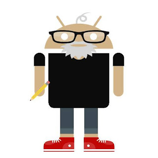
Androidify, because work is never serious
Weird, didn't show the picture first tim around. Anyway, used Androidify to make a self portrait. I thought it was pretty good. But when I tried to make one of Ruth it all went to pot.
Monday, 1 June 2015
One of my favourite packaging pictures
So, I like prawns, ships, lobsters and crabs. Both to look at, draw and have for lunch.
I think this simple drawing of a prawn, found on the front of a packet of uncooked prawn crackers is absolutely superb. Just makes me a bit happy to look at.
Prawn crackers were good as well, you can cook in Microwave - although they are very much better in hot oil, and expend to about 10x original size.
The local oriental supermarket sells these and some darker ones that are very strongly flavoured, for most people that I tested them on, too strong...
So I ruined Ruth...
This was a quick sketch for the Mental health book. Really just trying out pens and pencil together. But I used too much fixative and the ink -which is waterproof and permanent - ran badly and soaked through to the other side and made that run.
Was more hacked off about that than this. The castle ended up being a two hour long doodle really - and this was pure experimentation.
Still I suppose she has a reason for being unhappy now!
Was more hacked off about that than this. The castle ended up being a two hour long doodle really - and this was pure experimentation.
Still I suppose she has a reason for being unhappy now!
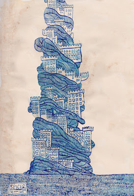
Accidental Castles (Experiments with distressed paper and drawing ink.)
These are really almost doodles. The first drawing in brown ink was a doodle I did after walking up from hospital to the top of Clifton. The buildings sprouting out of the walls and hillsides was the inspiration. Except, of course they didn't really much look like this. It was also an experiment with distressed paper (Stained with tea leaves and old tea bags.) and then drawn on using a dip pen and W+N coloured drawing ink.
I don't usually put my name on these things, but I got bored drawing all the little lines so the box cut down the work a bit. (I tried to count them, about 2500...)
This was the second drawing. Now I'm just making it up. This was a dip pen with W+N Blue drawing ink. The original showed stains from the other side where I used too much fixative (See post) and soaked through. Much to my surprise the blue dip pen ink bleed lots.
The bottom one is the last one I did this morning. Still experimenting, this time fountain pen ink - the luminous blues - and Intense water colour pencil, the darker blues. Did mean to colour some other bits in, but haven't so far. I'll post them if I do. Probably I'll add colour and further distressing digitally. Also considering drawing in black ink and then doing the colours completely on the computer. Will give me more control.
Do you think the blue or the brown works better on the distressed paper? Do add a comment. Also, if anyone knows better ways of distressing paper I'd like to know.
Labels:
artwork,
castle,
colour,
digital colouring,
grunge,
imagination,
ink,
intense,
pen
Subscribe to:
Comments (Atom)


